On average, customers tell 16 people about a negative experience they had with a company. 88% of online buyers aren’t likely to return to a site after a poor UX.
What is a good e-commerce UX, anyway? Let's explore how to create the best user experience and keep your customers engaged on your website, encouraging them to spend more time browsing and making purchases.
What Is UX in E-commerce and Why Bother?
An e-commerce UX refers to the user’s sentiments, feelings, and experiences when interacting with a website, product, or service.
As you have seen from the above statistics, user experience has a great impact on word of mouth and customer retention. On top of that, it influences sales considerably. Businesses lose 35% of sales due to a bad e-commerce user experience.
It’s also worth knowing that one dollar invested in UX brings as many as 100 dollars in return.
Let’s see how e-commerce companies try to deliver great user experiences.
What Is a Good E-commerce User Experience – Top 5 Examples
According to UX research conducted by Baymard Institute, as of today, the top five e-commerce sites that have managed to build better user experiences than others are: Walmart, Wayfair, Best Buy, Amazon, and Grainger.
Let’s take a closer look at each e-store.
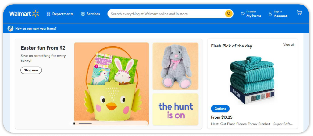
Walmart
Walmart can boast of convenient on-site search options, consistent product descriptions, and good mobile performance.
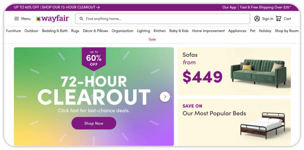
Wayfair
The best results were achieved in Wayfair's order tracking and returns process. Besides, it has substantial product pages, self-explanatory images and thumbnails, available filters, and sorting options.
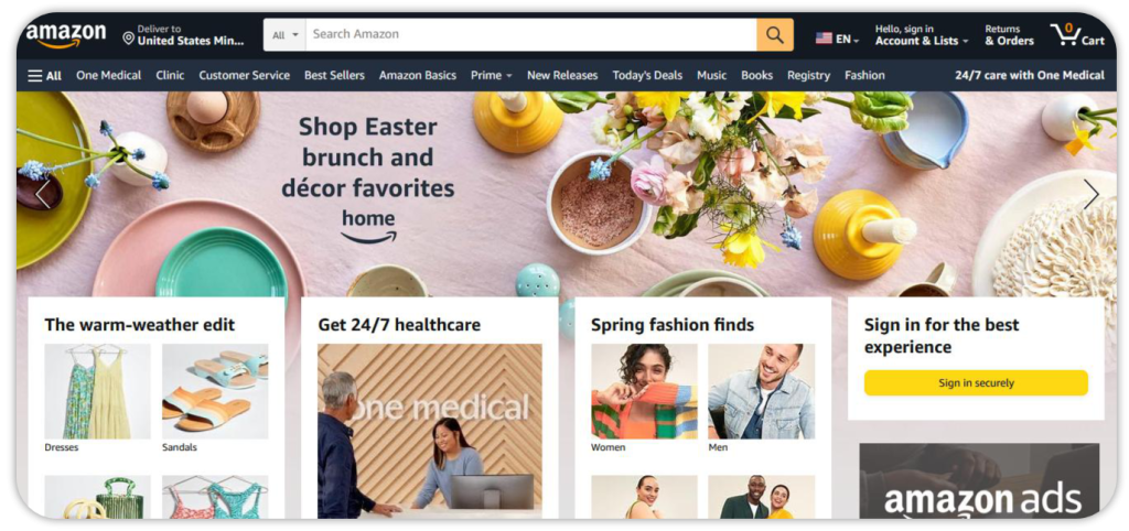
Amazon
The study highlights Amazon’s advanced filtering options, essential product attributes mentioned in descriptions, web search, and guidance with suggested alternate queries. Amazon also uses customer feedback to improve shoppers’ experiences (read more here).
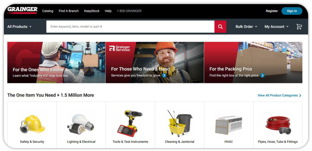
Grainger
Search autocomplete, search query types, and mobile experience with easy navigation in Grainger’s UX have received the highest rank from Baymard.
Best Buy
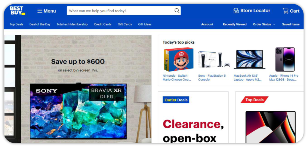
This e-commerce giant has got consistent visuals, unique styling of “Add to cart” buttons, and an easy checkout process, among other things.
How Can I Improve My E-commerce Website UX?
Follow the actionable tips below to make your customers enjoy their buying experience.
Polish UX Design
Research proves that 94% of people judge a site or app by the “look and feel”. This first impression helps them decide whether they will stay or look for a more visually appealing place on the web. Not to mention that a well-designed website can have a 200% higher conversion rate than a poorly-designed one.
While working on user experience design, you should focus on images, texts, interactive elements, and calls to action.
Images and texts
Low-quality product images and illegible texts are among the most typical design mistakes that worsen online shopping experience and kill conversions altogether.
Your product photography should be high resolution, pleasing to the eye, accurate and relevant to the item it represents.
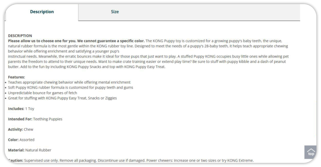
As for product descriptions, they must supply customers with practical information about features, measurements, use cases, specifications, and more. Here’s how PetSmart describes the puppy toy making it easy to find all the important characteristic features such as activity, color, material, etc.
Interactive content
You can benefit from e-commerce quizzes or other interactive forms to gamify user experiences.
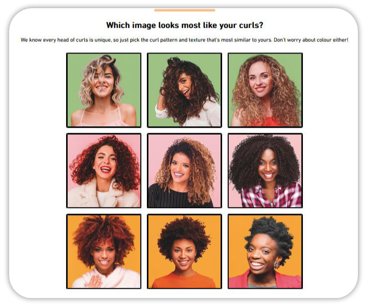
For example, Curlsmith, a haircare brand, offers a Curl quiz to educate customers on the best care methods for their type of curly hair.
Check some other examples of e-commerce stores using engaging content: from quizzes to link lists.
Call-to-action (CTA) buttons
A CTA button is one of the obligatory things to add to your landing page.
Mark Pierce, CEO of Colorado LLC Attorney, explains how to create CTA buttons to deliver positive UX and convert more visitors into customers:
“When crafting CTA buttons, choose highly-attractive colors: red, orange, or green.
You should also use some action-words: buy, order, submit, join, book, get, apply, etc. Besides, create a sense of urgency with such words as now, today, instantly, and make the call-to-action text readable and large.”
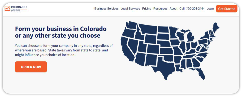
Note: HubSpot found out that red buttons outperform green ones by 21%.
Optimize Mobile Experiences
Mobile shopping has become a trend of today. In fact, 91% of US adults under 50 confirm they have purchased things online via a smartphone at least once. M-commerce sales are projected to almost double and go above $700 billion by 2025.
That’s why it’s crucial to create an engaging and accessible mobile user experience.
You may want to simplify your navigation menu. Just like Saltrock did, for example. The British surfwear company replaced a list-based menu with a button-based one and increased mobile conversion rates by 12%.
Also, make sure you’ve got a mobile-friendly lead page with high-quality images, easily readable headers/subheaders, and concise forms, CTAs, and copies.
Minimize Loading Time
A quick-loading e-commerce site is the #1 way to make a lasting impression on your visitors and get conversion rate improvement.
How fast should it be to ensure a positive user experience?
47% of online shoppers expect a web page to load in two seconds or less, and 40% of consumers abandon a website if it takes more than three seconds to load.
So, the golden rule for an e-commerce store is to keep it under two seconds.
What if your e-store loads longer than that?
Here are some tips on reducing loading time mentioned in this guide by HostPapa:
Compress and resize visuals
Take advantage of a lazy loading strategy
Use a content delivery network (CDN)
Reduce page size with compression algorithms (GZip or Brotli)
Delete useless plugins
Minify scripts
Pick a faster hosting provider
These tactics will improve your overall site’s performance and speed.
Implement Customer Segmentation Tactics
Effective customer segmentation can help you provide customers with the smoothest possible user experience on your e-commerce website.
By segmenting your audience into groups based on some common characteristics (age, income, location, hobbies, etc.), you can create personalized messages and make individualized offers. 80% of consumers are more likely to buy from a brand that provides a personalized experience.
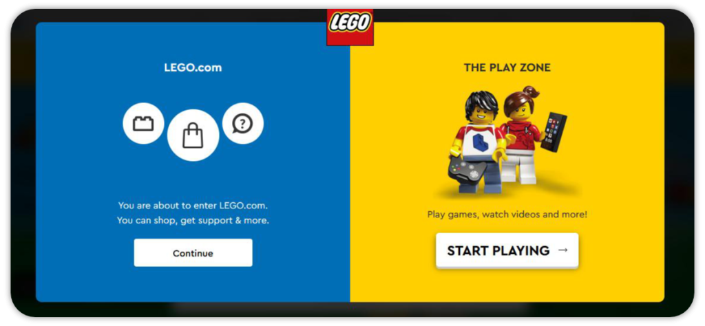
LEGO, for instance, segments leads by their specific needs right from the moment they land on the website. It’s a road post that directs visitors either to the e-shop or the play zone.
Another example is a psychographic segmentation by Jockey, an underwear, sportswear, and sleepwear retailer that offers eco-friendly solutions to individuals who prefer sustainably-sourced styles.

Help Users Find Products Faster
“One of the greatest ways to enhance visitors’ experiences in your e-commerce store is to slip the right products into their hands immediately, once they open your e-door,” says Max Wühr, Co-founder & CGO at FINN.
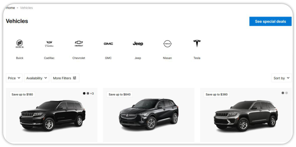
“The simplest solution is to offer bestsellers or trending items. For example, we mention the most popular cars right on the homepage.
In addition, we also provide advanced filters like vehicle type, transmission, fuel type, and others, in order to help customers decide on the best-fit car subscription plan,” he mentions.
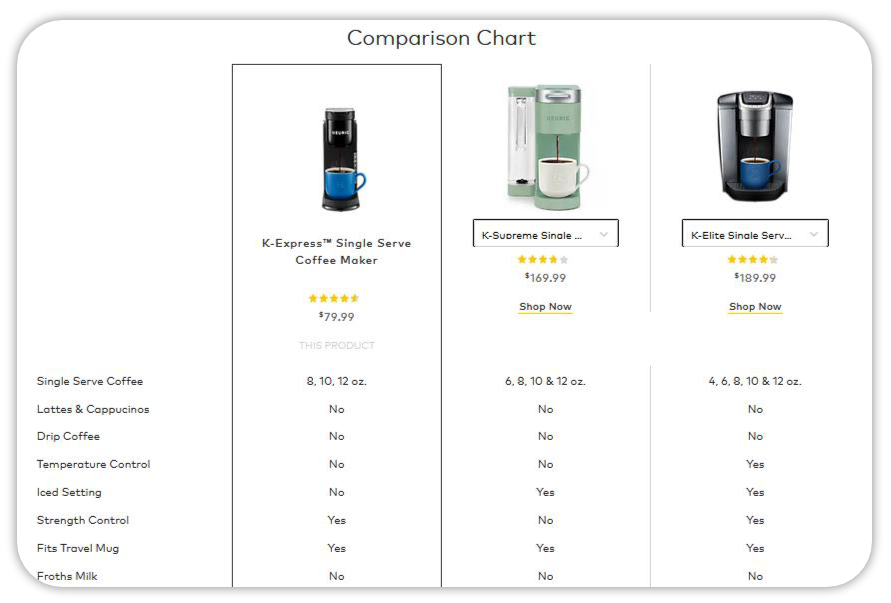
You should also make it easier for users to compare goods they may be interested in. For example, some e-commerce businesses like Best Buy or Keurig offer comparison charts to help customers easily evaluate several products at a time.
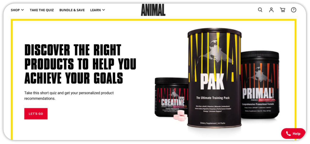
Aside from the filter-sort-compare trio, you might want to try guiding your site visitors to the suitable item they’re looking for with product finders or recommendation quizzes. A product recommendation quiz is a go-to element in e-commerce UX design that can help you personalize user experiences.
Create a fun and interactive product finder quiz with involve.me and make online shopping faster and simpler for your customers.
Add Online Calculators
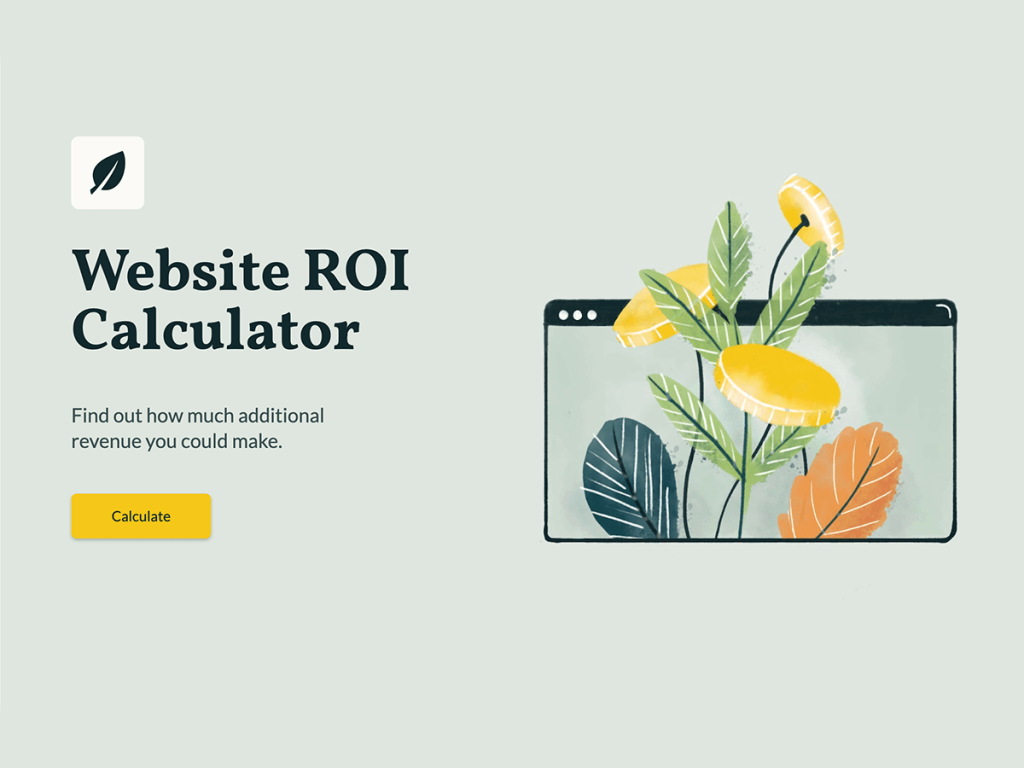
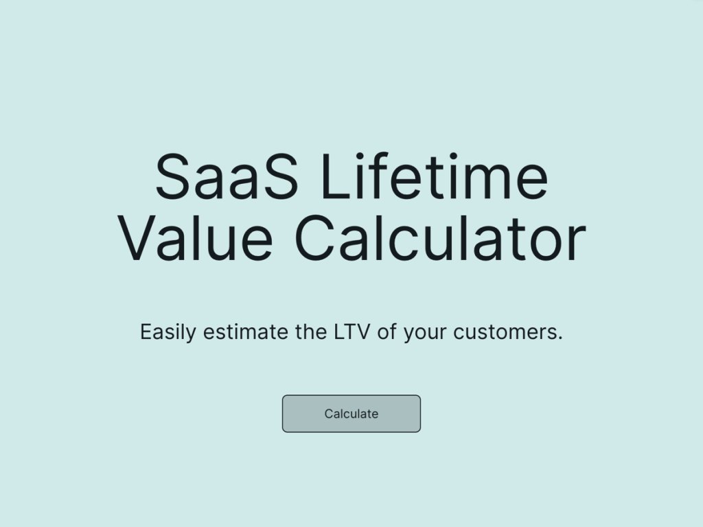
Custom calculators help e-commerce businesses engage and interact with casual browsers, remove user pain points, and personalize experiences.
You can offer your target audience an online calculator that addresses their individual needs and improves UX on the go. Your website visitors can calculate individual price quotes, discounts, shipping costs, and other important metrics.
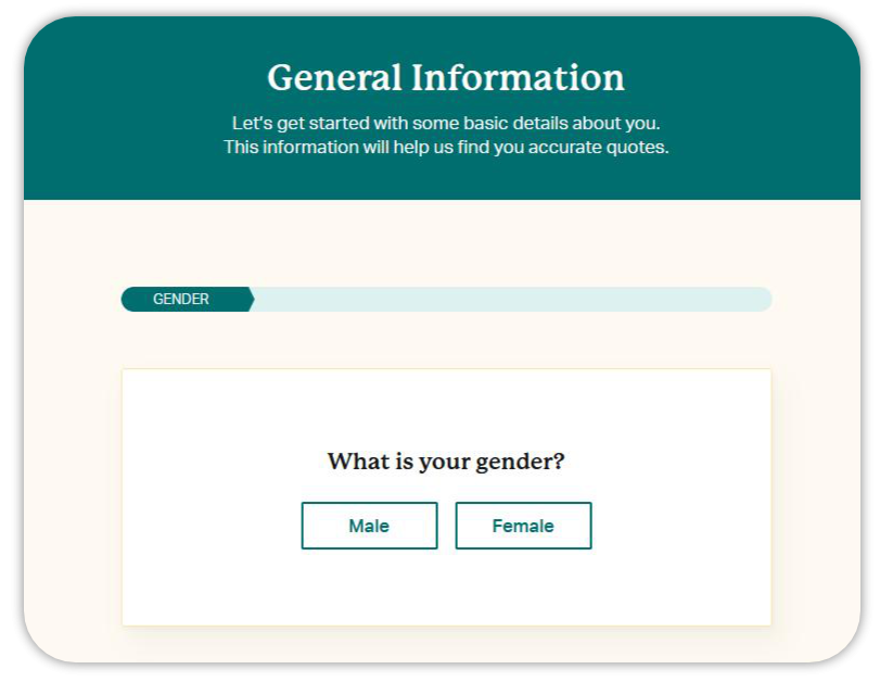
For example, ChoiceMutual, an insurance broker, uses a custom price quote calculator to help website users compare plans and prices from multiple service providers.
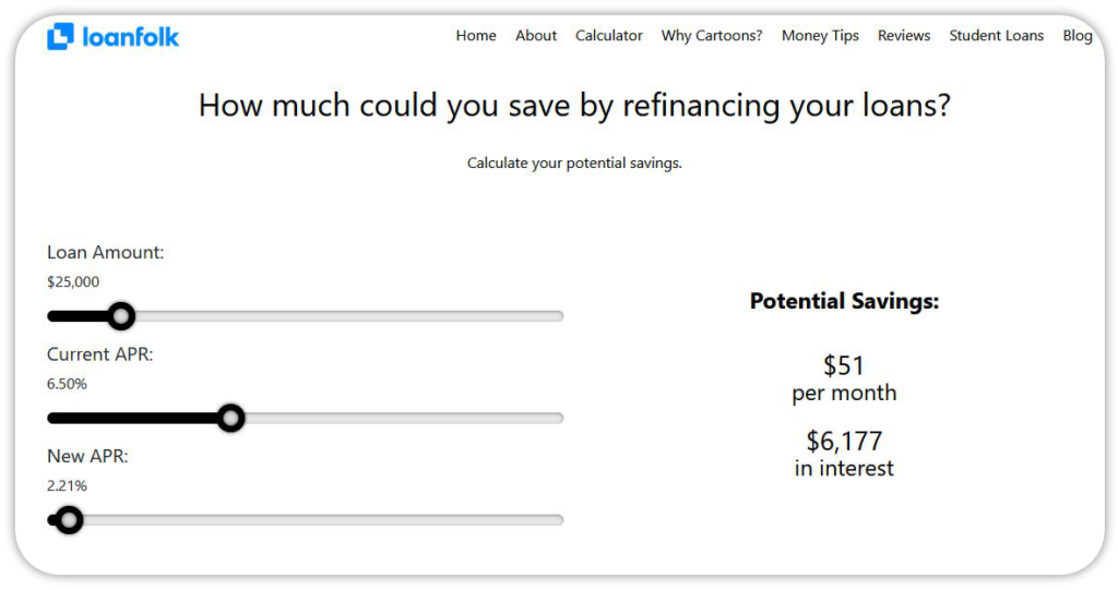
Here’s another example: LoanFolk’s financial calculator with sliders for calculating potential savings.
You can also create a customizable interactive calculator with gamified elements, multiple choice questions, and more. For that, use involve.me calculator builder without a line of code or pick one of the calculator templates to embed it on your website right away.
Create You Own Custom Calculator
Using pre-designed templates
Offer Incentives and Freebies
People love free stuff. Show me who doesn’t!
“If you’re looking for the driving forces of great user and customer experience in e-commerce, freebie marketing is one of the most powerful ones,” believes Jerry Han, CMO of PrizeRebel.
“It’s actually a game-changer for our business. It helps us build stronger connections with our existing or potential users and increase brand loyalty. We usually offer Amazon gift cards or such prizes as monitors, grills, steel bottles, mugs, etc.,” he shares.
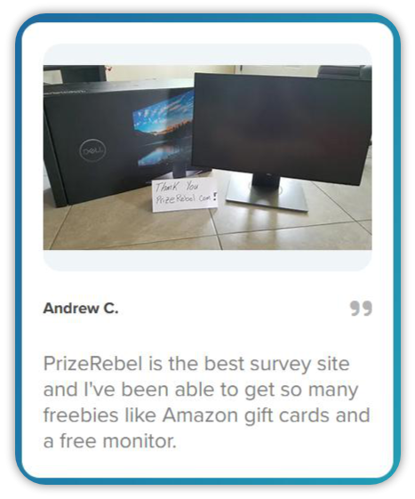
Jerry Han recommends welcoming your e-commerce store visitors with the following freebies and incentives:
Free shipping
Giveaways
Contests
Gifts
Bonuses
Discounts
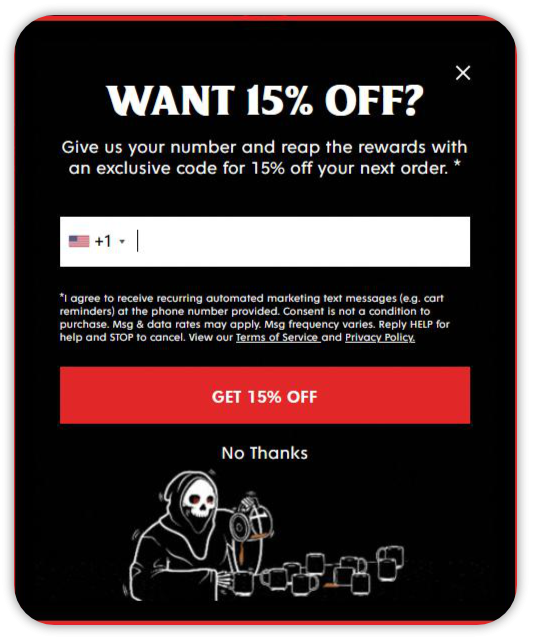
You may use a discount coupon as an attractive lead magnet in exchange for contact information.
E.g., Death Wish Coffee offers an exclusive code for 15% off and collects phone numbers for SMS marketing.
Here’s how 1Body, a nutritional supplement provider, intrigues users with a mystery discount for email subscription.

Why not power up your e-commerce website UX with limited-time offers?
Have a look at this interactive GIF with a tempting deal for one day only at LOFT Outlet.

Use Positive Emotional Triggers
E-commerce UX is all about emotions and feelings.
Researchers prove that positive emotions are a key factor for customer satisfaction, word-of-mouth generation, and loyalty to the brand. In fact, 70% of consumers prefer companies to be funny and use humor whenever it’s applicable.
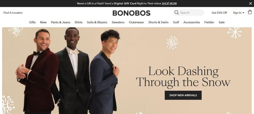
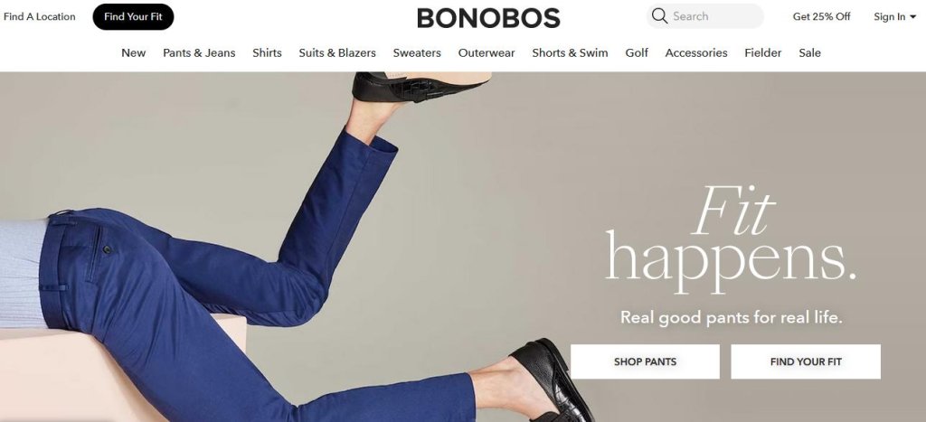
You may use an edgy, playful tone and add fun to interactive forms on your e-commerce website or win your customers over with funny phrasings. Bonobos, a men’s clothing and accessories brand, for example, has recently changed their winterish header.
From“Look dashing through the snow”
To“Fit happens”
Don’t forget about the cases when your e-commerce site is out of reach due to some reasons. When websites are on maintenance, for example, visitors typically see a dull error page that evokes nothing else than irritation and disappointment.
Consider replacing a boring message with something humorous instead. Learn from ChatGPT’s developers who asked the AI chat to write an acrostic poem to entertain users when the chat itself was at capacity.

Let’s Create a Positive User Experience on Your E-commerce Site
E-commerce businesses worldwide strive for greater user experiences on their websites to build positive relationships with customers, enhance online reputation, and drive sales.
If you’re one of them, you should start applying e-commerce UX best practices straight away.
involve.me will help you take your first steps and unleash the power of interactive forms to make your e-commerce store one of the best shopping places on the web.

