A well-designed website can have a significant impact on spreading the word about your nonprofit's message and cause. It can inspire visitors to donate, help recruit volunteers, and educate people about your mission.
Your website should capture the attention of your audience and inspire action from its visitors. A website that is difficult to use or contains limited information and no visuals isn't going to cut it.
So, here are six nonprofit website best practices to help maximize engagement and visitor numbers, and optimize conversions:
1. Use Consistent Branding
Maintaining consistent branding throughout your website is essential. If it looks outdated or uninspiring, it’s unlikely to engage visitors or encourage them to take action.
It can be useful to create a digital style guide, setting out guidance on certain design elements, such as:
A color palette. Establish your brand colors and use them across the different pages on your website.
Typography. This refers to the typeface and font as well as the types of headings used to organize your content.
Your logo. Ensure your logo is a consistent visual on each of your web pages, as well as on all communications with your audience. Make sure it’s distinctive and recognizable.
Tone. This refers to the tone you use when speaking to your audience. Do you prefer an informal or formal style, for example?
Visuals. What type and size of images should be included on your site?
Your style guide should inform all decisions on how your communications look, including your email marketing, social media posts, paper communications such as leaflets and posters, and even your online donation form.
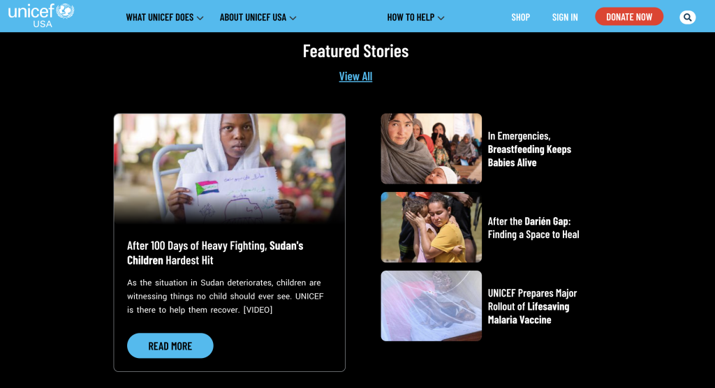
The UNICEF website is a good example of consistent branding, using brand colors, typography, and a recognizable voice to convey its message.
Remember to keep your target audience in mind at all times when writing or creating materials for your website. If you’re an international organization, there may be different considerations to take into account when designing for NZ domain names compared with American ones, for example.
Having consistent branding across all your communications, including your website, helps build trust among your audience and gives your organization credibility.
2. Write Captivating Copy
Articulating your mission and services is a key element of your nonprofit website. Writing captivating copy, then, is an important best practice.
You need to ensure that website visitors are captivated and compelled to stay on your website rather than exit immediately after they arrive. To do this, you need to not only consider what you say but how and where you say it.
Firstly, consider your target audience. You want to ensure your website copy is tailored to the people who are most likely to visit it. You may need to establish whether this is donors, members, volunteers, or the general public.
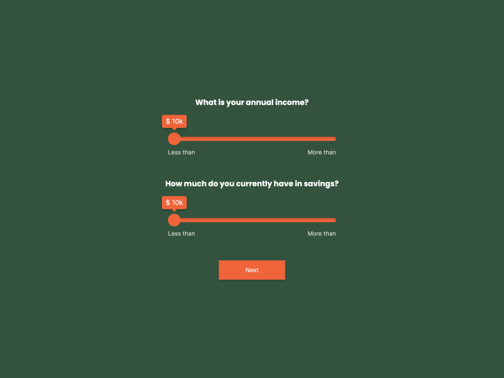
If you're not sure who visits your site, embed a branded survey into your homepage to:
Create a Survey Without Code
Start with a free template
Secondly, be sure to limit the use of jargon. Your website visitors want to understand what they’re reading and will be put off by acronyms or language that means nothing to them. Keep your phrasing simple and accessible to the layman.
Finally, ensure you break up your text using headings, subheadings, and short sentences or lists. This makes information more accessible and easy to read compared to huge blocks of text. Ergo, your message is more likely to be absorbed by the reader.
You can also use your website to connect with your audience through storytelling and demonstrate the impact your nonprofit organization has on the community or the wider world. Use this approach to engage with and capture the attention of your readers. A well-written story that explains the work your nonprofit organization does will likely encourage them to take action.
3. Provide Clear Calls to Action
Your website should include clear calls to action (CTAs) too. Tell your visitors exactly what you want them to do, whether this is signing up to volunteer, donating, or joining a mailing list.
Whatever action it is you’re encouraging them to take, your CTAs should be prominent and easy to find. Having a call to action button at the top of your home page, for example, can vastly improve your landing page conversion rate.
Consider creating a pop up for your website. Check out this article to learn how to do it without a developer.
Also, make sure it’s clear what will happen when visitors click on the button. The last thing you want is to have blurred lines around what they’re signing up for or to have to enlist the help of lawyers and their law office technology to bail you out of a situation that could easily have been avoided.
Include CTA buttons for important activities such as signing petitions on various pages throughout your site. As well as your homepage, you could ensure there’s one visible on every landing page and at the end of all your blog posts. Just remember to use clear but compelling labels so visitors know what they’re clicking through to do.

4. Optimise Your Website
Are you sure that people can easily find your website when they search online? Your domain name is hugely important when it comes to making your website discoverable, so complete a domain name availability check to ensure you choose the best possible moniker for your website.
Of course, the domain name isn’t everything, and using search engine optimization (SEO) is one nonprofit website best practice you can’t afford to ignore.
Research from Hubspot found that 75% of people only look at the first page of search results, so you need to make sure your website is on that list. To increase your chances of showing up there, you must ensure your website is properly optimized for searching.
To do this, you’ll need to research what keywords to use as part of your SEO strategy. For example, people looking for a charity dealing with homelessness might search for “homeless charity near me” or “local homeless shelters”. Once you’ve chosen which keywords you want to target, you have to write content tailored to these specific keywords.
The examples above highlight the importance of using the right domain name (which we briefly touched on earlier). Visitors searching for local organizations will likely be looking at the domain name for clues. That’s why a Canadian nonprofit organization, for example, would be wise to complete a domain search Canada to assist in their localized SEO efforts.
When it comes to writing content that includes specific keywords, ensure that you don’t compromise on its quality. Publishing good quality and up-to-date articles on your website is actually another way to increase your chances of appearing higher up the search engine results page lists. That’s because Google and its counterparts don’t like stale or out-of-date copy. (You can use our earlier tips on writing compelling copy to make sure you don’t fall into this trap.)
5. Include a Blog
Another nonprofit website best practice is to include a blog. An engaging blog can drive traffic through search engine optimization, as discussed above, and can also be a great place for your CTA buttons.
Not only that, but a blog is the perfect place to tell stories about the impact your nonprofit has and gives you more content to share on your social channels too (again driving more traffic to your website).
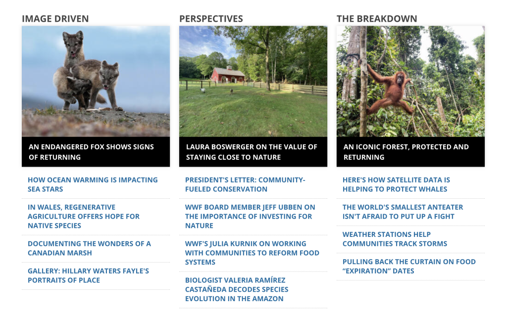
Lead generation through social media can be huge and is definitely worth investigating for your nonprofit organization. The World Wildlife Fund has an active blog and online magazine which illustrates how to do this well.
You can use your blog to write about a variety of topics. Here are some ideas:
Behind-the-scenes insights into your nonprofit organization
Volunteer or member spotlights
Sharing industry news
Summarizing research your nonprofit is involved in
Compelling success stories tied to your nonprofit work
When writing blog posts, remember to refer back to the other nonprofit website best practices we’ve already discussed. Consistent branding, captivating copy, clear calls to action, and SEO are all relevant here.
6. Ensure Your Website is User-friendly
A user-friendly website is another must. It’s essential to make this easy to use and uncomplicated for visitors—otherwise, they’ll simply click away from it. Use intuitive navigation to make sure it doesn’t take more than a few clicks to reach any given page.
Consider incorporating a simple navigation pane on your website or a clearly labeled menu to direct users to its various parts. Many people will look for an “About” or “Contact Us” page. Make sure these are easy to find.
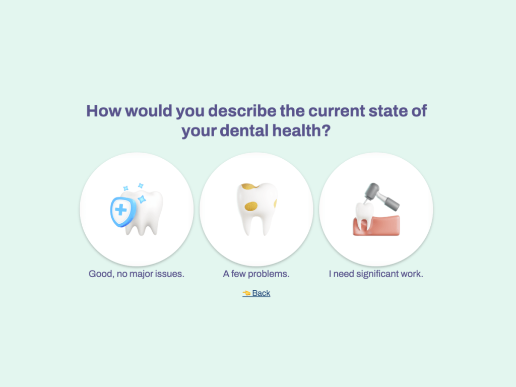
If you want to include tables or charts, there’s a WordPress table plugin that can help with this. A great way to present more complex information is to guide users through online quizzes to help them find the solution that will work best for them. Use these templates to create your own quiz to engage donors:
Create Your Own Quiz
Without a developer
Importantly, many users now access web pages via their smartphones, so you must optimize your site for mobile. Depending on your target audience, you may also decide to launch an app. You can use a beta tester application to ensure this runs as expected before you officially release it.
Keeping on top of emerging web development trends will help ensure that your website is delivering an optimal customer experience.
Key Takeaways
Creating an effective nonprofit website is hard work, but with our checklist of best practices, you can make sure you get it right. If you’re launching your website for the first time, it’s worthwhile checking out this website launch guide by markup.io for some handy tips and tricks.
You must ensure that your nonprofit website:
Has consistent branding
Uses captivating copy
Provides clear calls to action
Is optimized for search engines
Drives traffic through blog posts
Is easily accessible
Follow these steps and it will have a profound impact on the success of your nonprofit, allowing you to work toward your mission, raise awareness, and continue doing great work for your cause.


