By now, you probably already know how important landing pages are. They can help you target specific audiences, generate more leads, and so much more.
You’ve read all about how essential they are for your marketing strategy, and you’ve even created a few... but your numbers aren’t adding up.
Sure, you’re getting the clicks, but when your users arrive on your page, they’re not converting. In fact, all they seem to be doing is scrolling around and then leaving. You’ve got your CTA’s. There are no broken links. What’s going on?
The truth is, although they may look fairly simple, creating a landing page with high conversions can be challenging.
If you’ve been struggling to create high converting landing pages, perhaps you’ve been making one of these common mistakes.
1. A Complicated Design
When we’re talking about a complicated design, what exactly are we referring to?
Clashing colors, fonts that are hard to read, and having multiple CTA buttons with different offers are just some of the usual culprits.
Simplicity is one of the most essential elements of your landing page, and unfortunately, this is where many marketers go wrong.
Why?
Well, because many people assume that the more complicated the design is, the more they’ll impress their audience.
Here’s why this doesn’t work:
You see, the average person is online for over four hours per day. Besides emails or research, people also commonly use their mobile devices to connect with their followers or friends on social media. While online, they are exposed to different brands, videos, GiFs, images, etc. This means that your market is continuously flooded with all types of content.
Creating a complicated or crowded landing page design is more likely to frustrate or overwhelm.
To convert and start building relationships with your market, aim for simplicity in both design and copy.
How do you achieve this?
The 7 Principles of Conversion-Centered Design outlines this perfectly. It highlights that for your design to be effective, there needs to be one specific action that you want your user to take.
What happens if you’ve got several offers for your market?
When your user arrives on your page, and there are multiple offers, they’re more likely to get confused about what you want from them and then leave without taking any action.
Unfortunately, many marketers are making this mistake because research shows that around 48% of landing pages have several offers.
To improve your design, opt for a clutter-free and well-organized design that focuses on one specific action for the user to take.
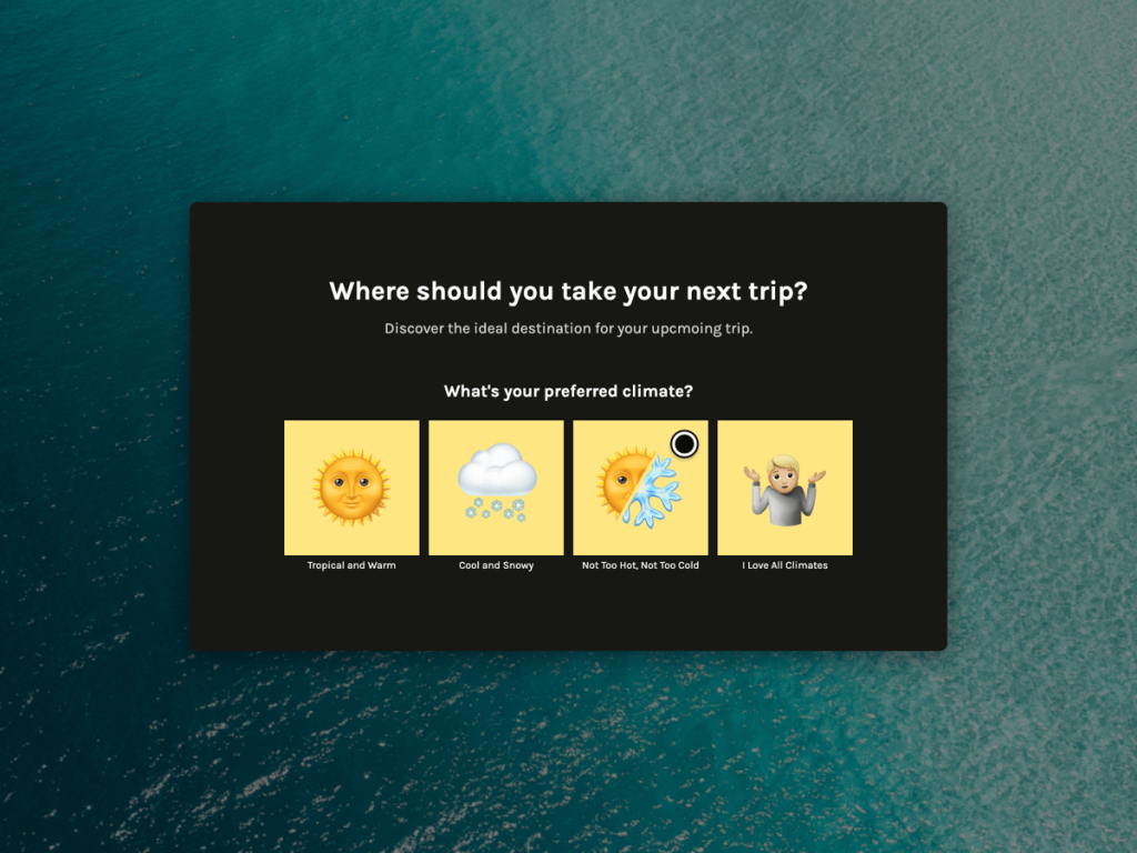
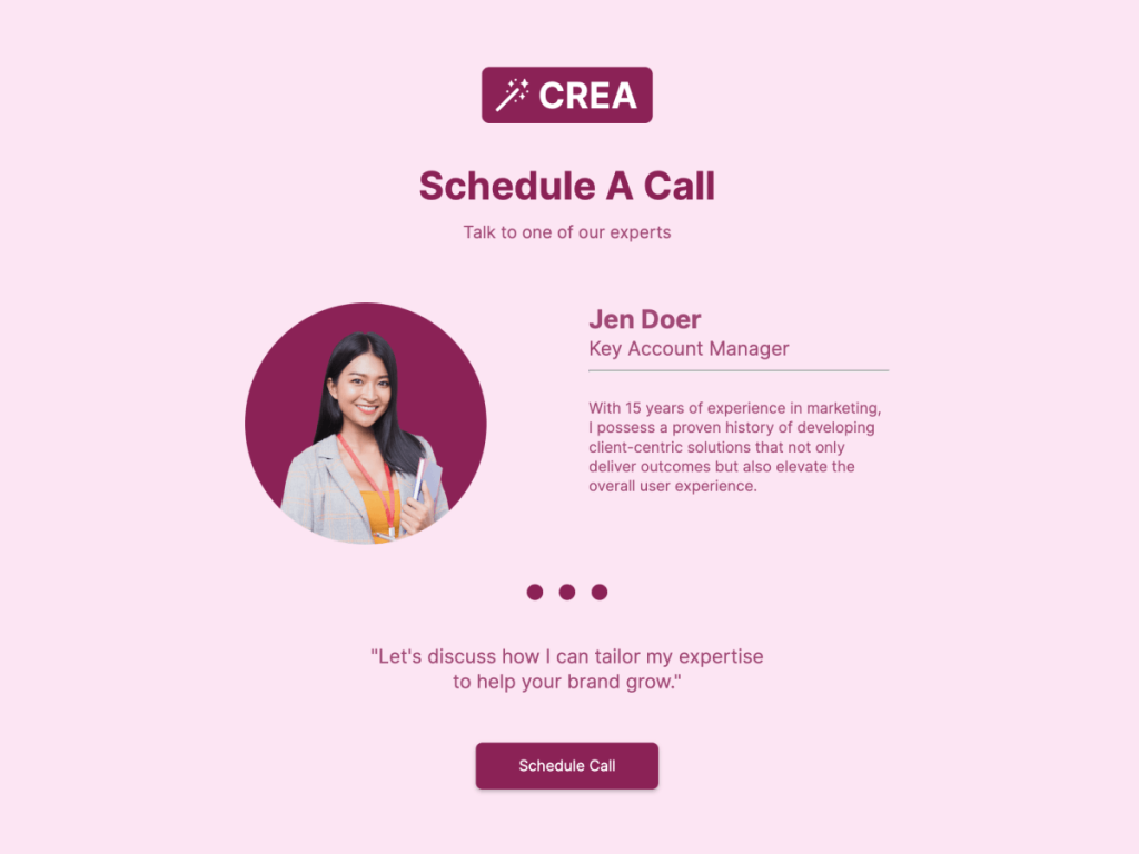
Here’s a great example of a clean landing page.
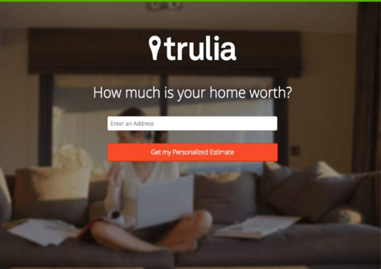
In just a fraction of a second, it’s very clear what is expected from the user. The user doesn’t have to read much, and there aren’t any distractions that can both confuse and frustrate them.
2. Generic Call-To-Action Buttons
Your call-to-action (CTA) button is one of the most critical elements of your landing page. After all, this button helps you finally get to capture your users’ details.
In the past, words such as Click, Submit, or Download were good enough for conversions, but the marketing game has changed drastically over the past few years. As highlighted earlier, you have a lot more competition now, and these terms won’t get you the results you’re after.
So, what words work best for CTA buttons?
Verbs and adverbs work best. You can also highlight what your user will gain.
Phrases like I Want That eBook, Join The Program Now, or Download Your Free Guide are much more effective than Click, Submit, or Download.
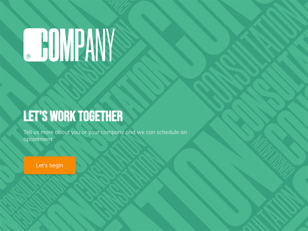
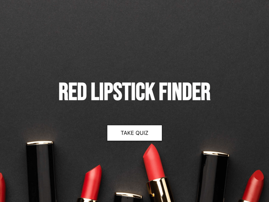
Let’s have a look at a couple of CTA button examples that get this right.
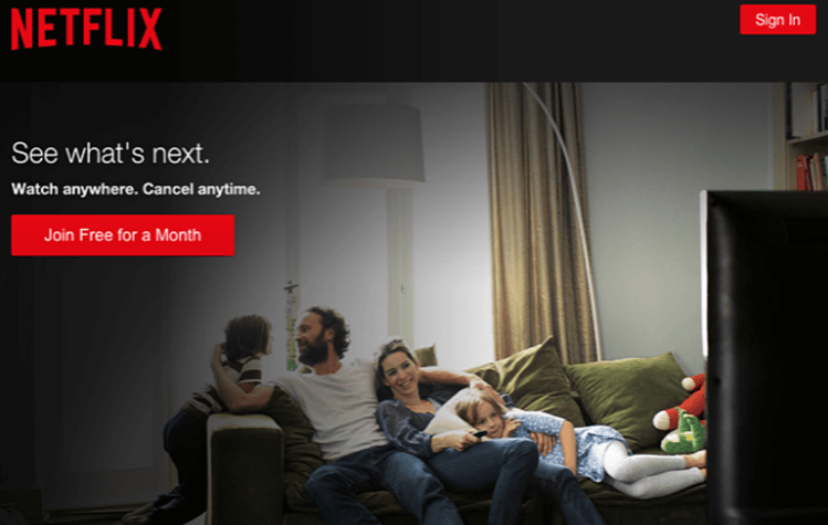
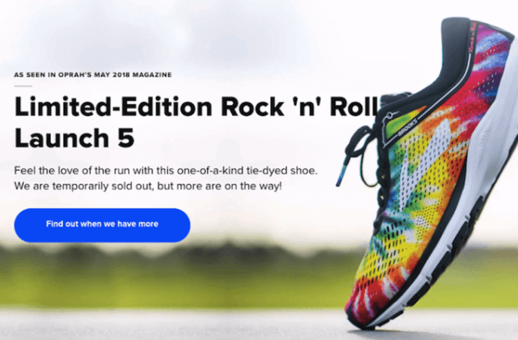
As you can see, using words that highlight what the reader will gain is a much more effective way to use your CTA buttons.
3. Weak Headlines
We can’t fully express how important a strong headline is. After all, this is what your users will see when scrolling down their feeds. The headline is what will either grab their attention or make them scroll past your link.
So, how exactly do you make sure that you inspire your audience to click and go to your landing page?
Well, first, you need to understand what a good headline does.
A good headline is uncomplicated, easy to understand, and piques the interest of your readers.
You see, people are very busy. They don’t have the time or energy to try to figure out the meaning of a complicated headline. So, your job is to make sure the headline is compelling as well as simple.
4. A Slow Loading Page
It’s crazy how much of an impact a page’s loading speed is. Studies reveal that 74% of users will leave a page if it doesn’t load within five seconds.
These numbers highlight one thing - having a slow-loading page isn’t an option. So, how exactly do you go about improving your page’s loading speed?
First, you need to test your page.
You can achieve this by using a tool like Google’s PageSpeed Insight or Pingdom. These will help you not only understand the speed of your page, but you’ll also get recommendations on which elements to optimize to help you improve the speed.
After testing your page’s loading speed, you’ll need to look into your coding.
Complex coding can have an adverse effect on your page’s loading speed. You can achieve this by reducing unnecessary elements like excessive JavaScript and tags.
Lastly, pay attention to your images.
Visuals help us communicate messages quicker than words. In just a second or two, a striking image, GiF, or video can help you get your message across. Studies have also revealed that people are visual beings and retain information from images better.
But here’s the catch - images can also slow down your page’s loading speed.
So, what can you do?
You can start by ensuring that you compress and resize your images before you upload them. To help you, you can use a simple tool like Compressor.io, which helps to reduce up to 90% of your file sizes.
This will help to ensure that you keep your visual elements while not compromising your page’s speed.
Are Your Landing Pages Sabotaging You?
As highlighted earlier, great landing pages are crucial to marketing.
However, if you have a complicated design, CTA buttons that aren’t inspiring, weak headlines that are easily forgettable, or pages that take more than five seconds to load, then it’s going to be challenging to see the conversions you’re after.
If you’re guilty of any of the above-mentioned, it’s definitely time to make some changes.
