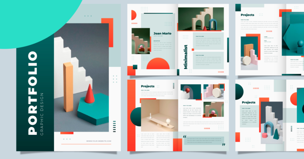
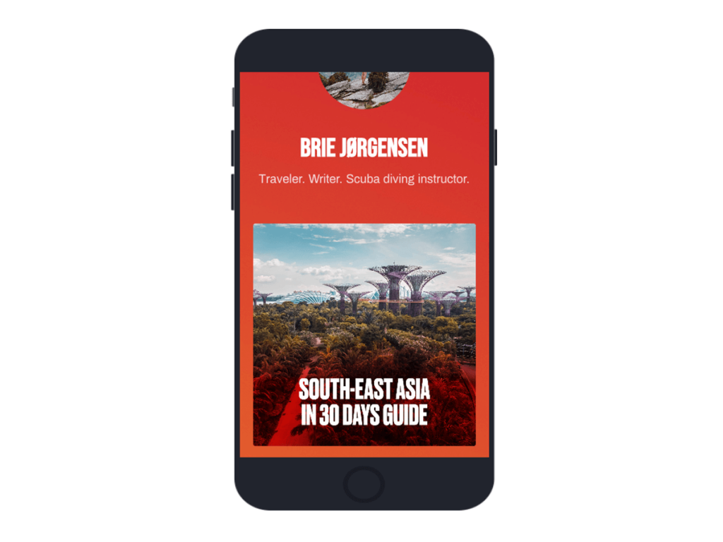
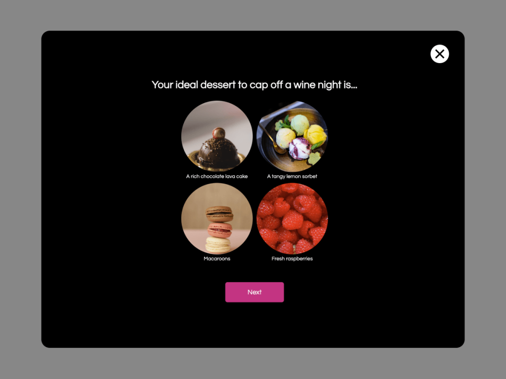
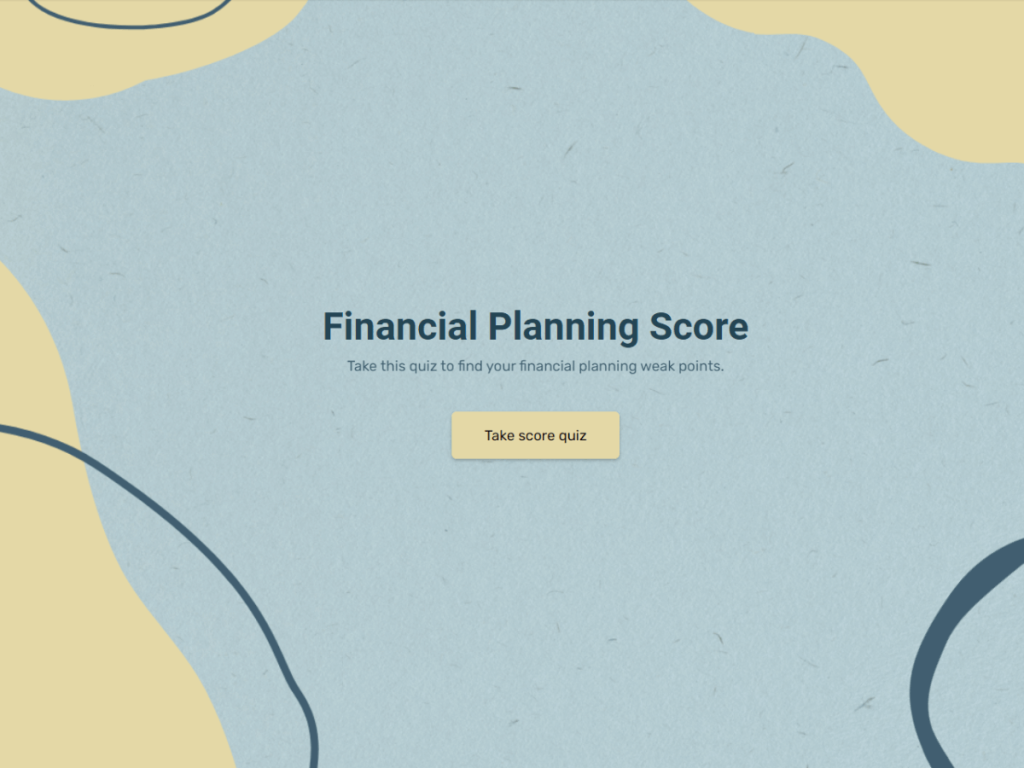
Clients want to see what you made for other clients. So make something beautiful, smart and memorable. I did not wake up to come here today and tell you your work isn’t good enough. Quite the opposite, I think you’re talented and with the right tools you can make really smart content that will make your portfolio justify however much you charge.
As always, I’m going to be super specific and link all the tools and free resources you need to make an elite marketing portfolio.
So what content are we going to put on your portfolio?
Here are some trends, that are actually just standard practices with trendy names:
We’ll be making:
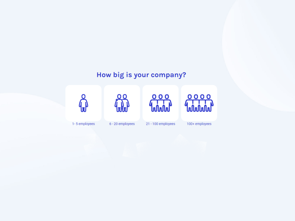
Customer onboarding flows
Lead generation quizzes
Product finders
Review generation flows
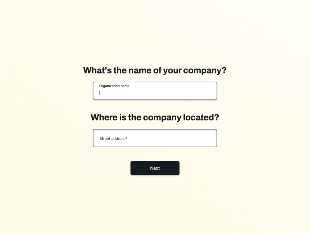
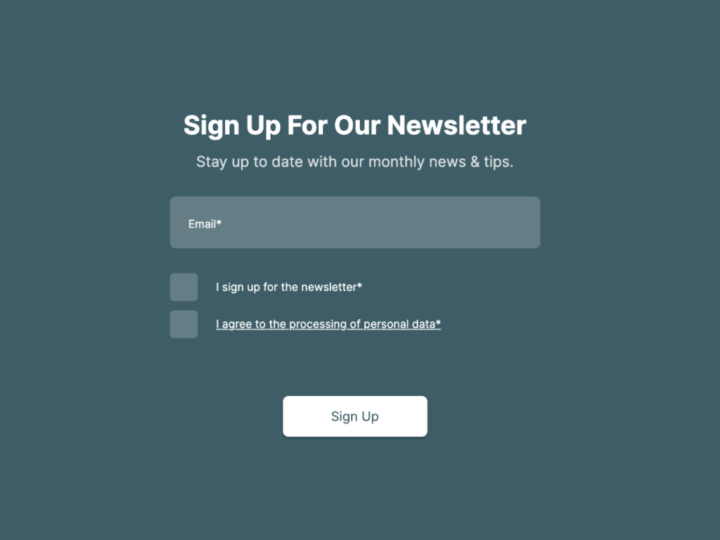
Smarter forms
Let’s go!
Customer Onboarding Flows
Onboarding your agency clients through a series of calls and listening to their pain points will never go out of style. I’m not trying to reinvent the wheel here. When I say customer onboarding flows, I mean making an automated flow for your client’s new customers.
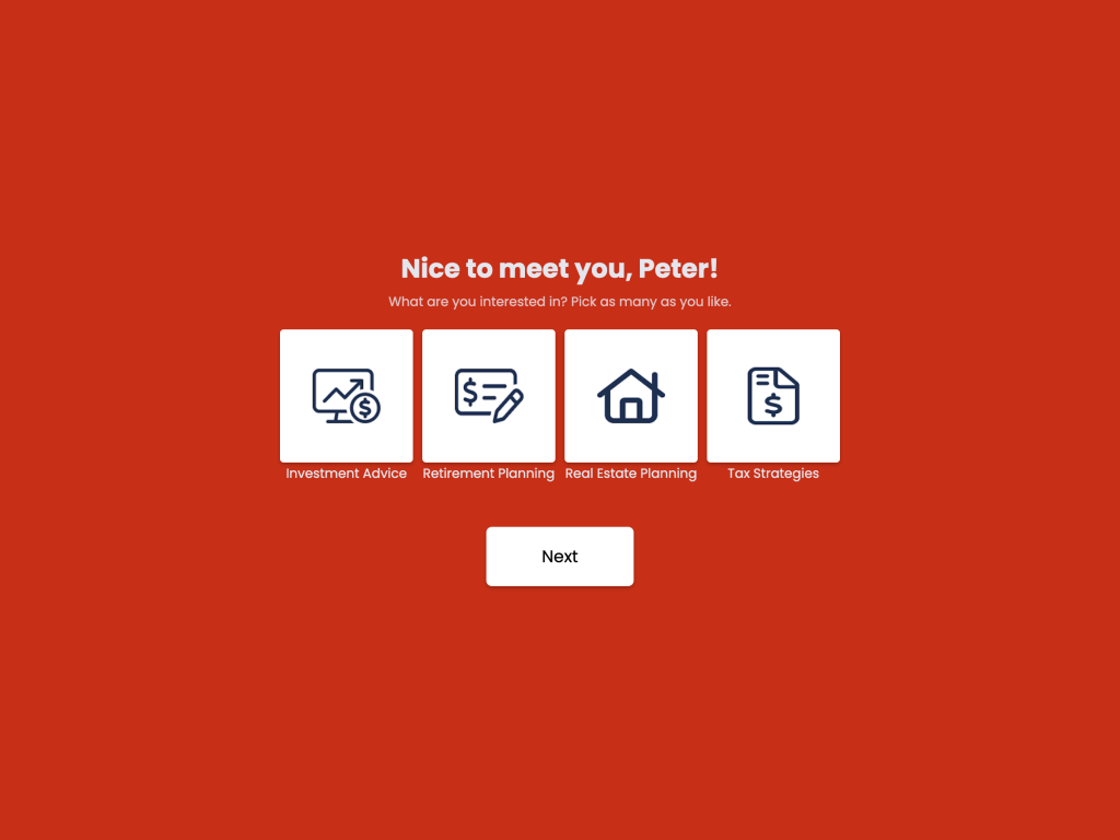
Let’s say your client is a therapist. Different people reach out to them for different reasons. Some need marriage counseling, some are dealing with addiction or processing grief. An onboarding flow you can make for the therapist will consist of a quick survey (three questions max) that puts all these people into different buckets.
An onboarding flow that segments customers early on has two benefits for your clients: It helps your clients see what’s most in demand It helps their customers get personalized content
Personalization is crucial when you’re expecting people to convert. 72% of customers will only engage with personalized messaging. An onboarding survey will help you segment customers by their goals, issues and interests so you can personalize all the content you send them.
Get Started: Make A Lead Generation Quiz
Using One Of Our 300+ Templates
Lead Generation Quizzes
BuzzFeed quizzes are not the next intellectual evolution of men. But there’s a reason they’re popular: the number one thing everyone is interested in is… themselves. That’s right, we’re back to talking about personalization. “How are online quizzes about personalization?” you ask.
Let’s look at some quiz headlines: “What your pizza topics say about your attachment style” “What Star Wars character are you?” “What Timothee Chalomet hair day are you?” this one has someone else’s name in it, but it’s still about you!
BuzzFeed quizzes have a 96% completion rate. That’s crazy. Your landing page could never. No offense, but like, objectively. The average landing page converts about 20% and that’s only if it’s in a well targeted ad or email. Lead generation quizzes are the future.
So how do you make a lead generation quiz for your clients? Take the “you” part of BuzzFeed quizzes and attach it to what your client’s are selling.
“You spend a third of your life sleeping. What mattress will help you wake up feeling well rested?”
“Skincare is self-care. What care does your skin need?”
“Protect your feet, reach your goals. What running shoes are best for you?”
Not only will these quizzes get your clients more leads out of the same budget, but they’ll also make a stand out addition to your portfolio.
Get Started: Make A Lead Generation Quiz
Using One Of Our 300+ Templates
Product Finders
Product finders are exactly what they sound like: they help you find the best product for each customer. They quiz customers about their expectations and preferences. A quiz just happens to be the perfect vessel to deliver an engaging and personal experience.
Online quizzes have come a long way from Buzzfeed to business. While we may never stop wondering “What your pizza toppings say about your attachment style”, quizzes in 2025 will tackle more profitable questions. Questions like:
“What glasses suit your face?” to help online shoppers find the right frame for their face shape.
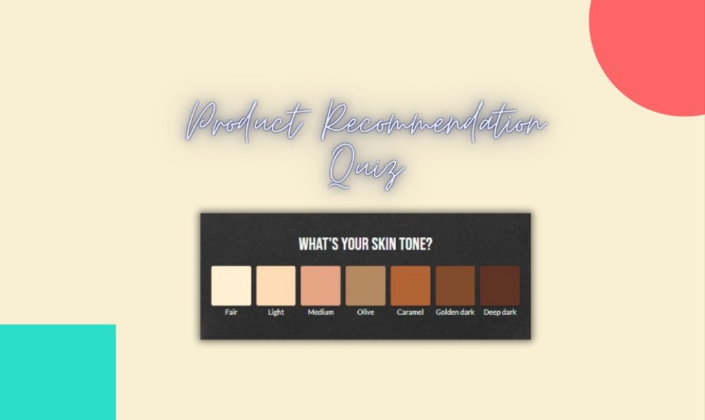
“What’s your perfect shade of red?” to sell a lipstick that matches your skin tone.
“How much would it cost to put solar panels on your roof?” to calculate the cost of making your home more eco-friendly.
A product matching quiz is data collection served on a fun platter. They help you get more people to answer your questions by making it less about what you’re trying to sell and more about what the customer needs. Which is why Forbes predicts interactive content like quizzes and personality tests to be an upcoming marketing trend.
Quizzes Convert 10x More Than Forms
Despite the twinge of cringe, Buzzfeed quizzes have a 96% completion rate. That’s right. That means pretty much everyone who clicks on your will give you all the information you ask for. Imagine in a world where the vast majority of people who click on your content do the one thing you’re asking them to do.
Traditional grocery-list-like forms only convert about 17% of the clicks. By 2025, marketers will be able to fully understand the engaging nature of quizzes and take advantage of it. Product matching quizzes help you get:
More out of your advertising budget. Grab a calculator and see what 10x conversions would mean for your business.
More personalized onboarding. Quizzes gather a lot of data you can use early on to personalize the way you speak to new customers.
More reach through viral loops. Quizzes are built to be shared on social media. Every time somebody shares your quiz, you’ll reach their friends and followers, who might share it as well. This creates a viral loop.
Review Generation Flows
Companies with at least 200 online reviews generate twice as much revenue. But how do you get 200 reviews? It’s a big challenge. Exactly the kind of challenge business hire marketing agencies for.
Every major company automates review generation. So learning how to do it and immediately setting it up for every new client will make your agency stand out. It shows you care about the funnel as a whole, it shows you care about delighting customers and it shows you have worked with the big boys, because review automation is standard practice for large companies.
So how do you automate review generation for your clients? It’s very simple. You need 2 things:
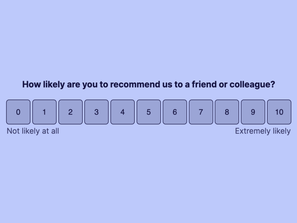
1. A net promoter survey. A net promoter survey is a survey that determines each customer’s net promoter score (also known as NPS, marketers love their abbreviations).
The NPS determines how likely a customer is to recommend you. It’s a zero to ten score that put customers into three categories:
Detractors - score 0 to 6. You do NOT want to ask these people for a review.
Passives - score 7 to 8. These customers feel luke-warm about you. They’d leave you a 4 star review, but not a 5 star one.
Promoters - score 9 to 10. These are your biggest fans. These are the people you want to ask for a review, because they would leave a 5 star one.
To make this NPS survey, grab the template I linked below. It’s free and you can edit it to match any brand. Yes, you can put your client’s logo on it.
A platform to collect reviews on. Depending your client’s industry, you can recommend the perfect place to collect all the reviews on. It’s better to have 200 reviews on one platform than having 50 on 4 different ones.
G2Crowd is the go-to place for SaaS reviews.
TrustPilot is for e-commerce.
Yelp! is for restaurants.
Google is for local brick and mortar businesses.
And Amazon is for… well, Amazon sellers.
If you have been following this channel for a while, you know I wouldn’t mention these if I didn’t have free templates that match each review platform. They are linked below.
I also made a video where I created a review generator from start to finish, go check it out if you want the full step-by-step tutorial.
Get Started with Review Funnel Templates
300+ Mobile Friendly Templates
Smarter Forms
This is going to sound weird, but hear me out: forms are… intimate. Wait, listen. People giving you their personal information is an intimate exchange. Your forms are asking people for personal information: their address, phone number, credit card information. I have blood relatives I don’t want to share that information with.
Forms need to feel personal. They need to establish trust and encourage honesty. If you send people a useless form, you’ll get useless answers.
So how do you make a better form for your clients? A form that’s worthy on your portfolio needs to be 3 things:
Conversational. It should be able to skip irrelevant questions and adjust the course of action, like a human would in a conversation. Like if I ask you if you’re allergic to peanuts and you say yes, I’m not going to offer you peanuts. That’s serial killer behavior.
And yet, so much of the information you put into forms gets ignored and you need to fill it in again AND SOMEHOW you still get emails that are completely irrelevant.
Mobile-first. Most of the world’s online traffic is mobile. It’s likely one of the issues your clients need help with. Showing off mobile friendly design on your agency portfolio is a smart move. Go mobile or go home.
Different strokes for different folks. Filling out a form should never be the end goal of forms. What happens immediately afterwards is just as important. If they filled out a form, that means they’re interested. Nurture that interest immediately. Land people on different pages based on what they tell you about themselves.
Instead of an all-size-fits-all “Thank you” page, send people to different part of their website. If they signed up for a webinar about reporting, direct them to your free downloadable spreadsheets. If they activated a “let me know when this item’s back in stock” show them similar items.
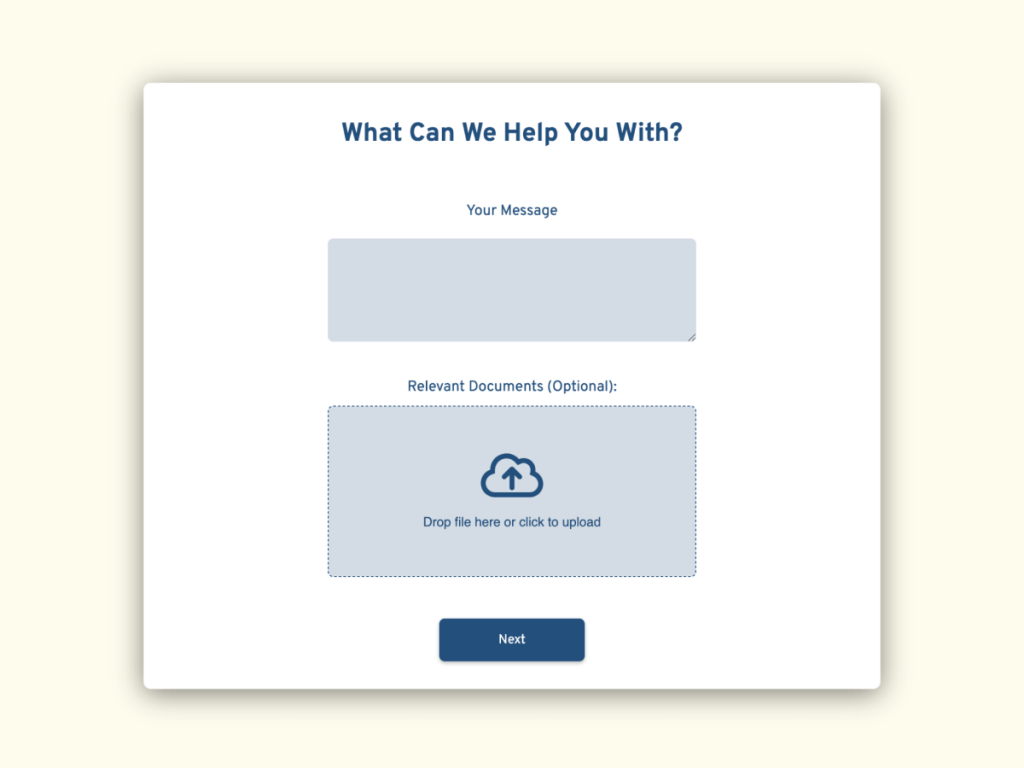
A smart form doesn’t just collect data. It’s a personal conversation with your audience that can help you nurture their interest.
