Payments need to be easy and personal. And with the right tools, it takes minutes to simplify, personalise and automate your payment process. This article will show you how to accept payments online the right way:
1. Provide a delicious user experience that’s better than your competitors’
2. Give a personal touch where it matters
3. Be transparent and honest with your buyers
Imagine walking into a store, filling up your cart, walking up to the cashier, putting the cart on the checkout area and just leaving it there as you walk away never to return. Sounds absurd, but it's what 85% of your users are doing.
According to a 7 year long study, 70% of carts are abandoned. Of the 30% left, half of them are abandoned at the checkout stage. Which means only 15% of users who initiate purchase end up paying.
The checkout stage is the most important and yet the most neglected part of your funnel. Users who made it all the way down to the bottom of your funnel eating up your ad spend and nurture efforts are the most painful to lose.
Bottom funnel users deserve more than a PayPal link. They still need guidance on their buyers journey. This is the time to pull out all your tricks and get personal. Guided buying is a personalised BOFU conversion strategy designed to stop your users from turning away at checkout.
Payments need to be easy and personal. Here's how to accept payments online the human way:
Improved User Experience
Speed, simplicity and reliability is what users look for in a payment page. Anytime, on any device. This means constantly optimizing your payment page’s performance and paying close attention to what everyone else is doing. Neglecting your payment page will cost you in the long run.
There are definitely bandwagons you can watch pass you by as you sit back in the comfort of a functional high-converting funnel you’ve had since 2017. But when trends become industry standards, you need to act fast.
How to optimize your payment page should be a data-based decision, not an educated guess. Tracking purchase intent and reacting to it in real time needs to be a priority for your business.
To update and optimize your payment page, you need access to customer behaviour data. How many users make it to the payment page, where did they come from, how long were they there and most importantly: How many users who visited your payment page actually completed a purchase.
involve.me enable you to access that data and use it to gain competitive advantage and provide a user experience that’s fluid, personal and quick.
Are you still not accepting payments through PayPal or Stripe in 2019? Not only are you late to the party, but you’re also losing customers. One click payments are so much faster than entering credit card information and that’s just one of the many buyers benefits of PayPal.
Thanks to powerful fraud and consumer protection plans in place, accepting payments online with PayPal and Stripe is not only faster and more convenient for your users, but also provides an extra layer of online payment security.
Personal Touch
On average 71% of consumers express some level of frustration when their shopping experience is impersonal. 44% of consumers say that they will likely become repeat buyers after a personalized shopping experience with a particular company. [...]
Depending on your business model and your lead qualifying process, your purchase cycle can last months. You had all this time to gather data about your users and their behaviour. Why not implement it where it matters most? Your payment page.
Be personal. By the time the users gets to the bottom of your funnel, you will have more than enough information to do so. “Your order is ready to be shipped” is sad and boring.
“Your Italian shirt will be shipped on Friday, Josh!” is where it’s at in 2020 customer centric payment pages.
In a world where you can make your payment page sing your buyer’s favourite song while they enter their credit card info, why would you not?
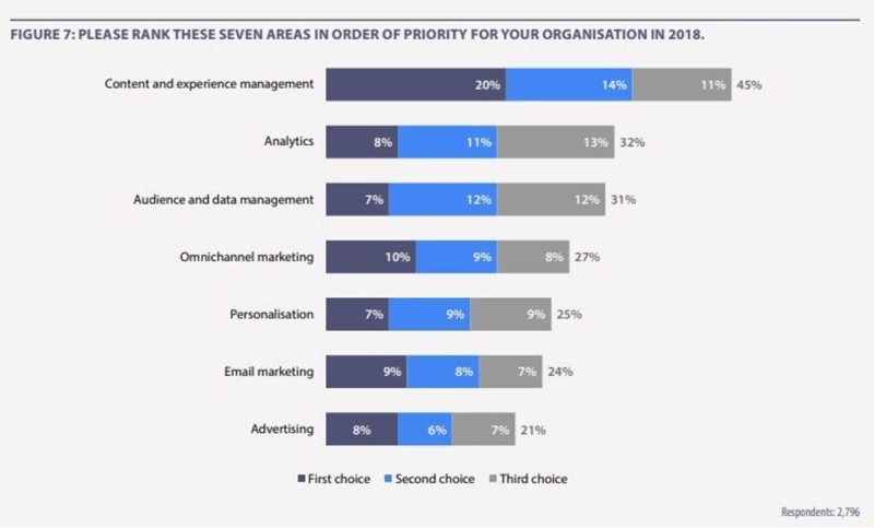
According to a recent study by eConsultancy, 75% of businesses don't consider personalisation a priority at all. At the same time almost half the polled companies identified focusing on content and experience management and analytics a priority. So they do aim to collect and analyse data and better their user experience, but without implementing personalisation. And that’s a miss. Only 22% of shoppers are satisfied with the level of personalisation they currently receive.
Personalising your payment page has an emotional impact that will affect your customers’ purchase decision.
Nearly half of shoppers surveyed by Segment (49%) have purchased a product that they have not initially intended to buy after receiving a personalised recommendation from the brand.
40% of US consumers said that they have purchased something more expensive than they originally planned, because their experience was personalised. [...]
Some more positive effects of personalisation include your clients to have increased chances to:
✓ Become repeat buyers
✓ Tell friends or family about you
✓ Leave a positive review
✓ Post a positive comment on social media

On the other hand, negative effects of no personalisation or personalisation done wrong are just as significant. If you get your user’s name wrong or misspell it, misgender them, show them stuff they are not interested in or ignore their negative feedback, be prepared for your users to:
✘ Not purchase from you
✘ Complain about you to friends and family
✘ Unsubscribe from your emails
✘ Unfollow you on social media

So it’s not only about whether to use personalisation in all stages of your users’ buyers journey, but also how to use it. Businesses are catching up and what used to be enough two years ago doesn't cut it anymore.
Research shows that that basic personalisation fails to engage consumers in a real way. Just 8% of survey respondents said that a brand addressing them by their first name would make them engage. Similarly, only 7% said they would be likely to engage with a birthday email.
Intelligent personalisation is not basic data collection. Anyone can do that. Recording relevant behaviour data and preferences and showing your users dynamic, real-time content is the level of personalization your customers expect in 2020.
Increased Transparency
Nothing makes users abandon their carts faster than a sneaky shipping fee that jumps in out of nowhere like an overcharge ninja.
It might seem counterintuitive to show higher prices before your shoppers have committed to the purchase process, but an all-included price is what they need to make a purchase decision and only then move on to checkout
Taking your shoppers all the way to check out and then racking the price up with taxes, handling and shipping fees will only piss them off.
If your business provides value and stands out among competition, it does not need to rely on click bait and cheap tricks to get more payments online. Or maybe that can be exactly what sets your business apart from your competitors.
An honest salesman is an oxymoron - it simply does not exist. According to a Harvard study, 82% of people don't trust salesmen. By adding honesty as a key part of your sales cycle, users will view you more as a valuable source of information they were looking for and less as a sleazy salesperson.
Whether they were just comparing prices or window shopping, providing them with all inclusive pricing gets the job done fast and fast gets you more sales. Honesty and speediness is what gets you ahead of your competition.
Surprise your shoppers in a pleasant way. Why not include a quick “If your purchase exceeds 100USD, you will get 10% off the whole order!” message? The same Harvard study found that most people were open to soft closing strategies, instead of “This is your last chance to buy” style hard closers.
”Soft close is based on a suggestion that leads buyers to believe they are acting of their own free will, when in fact they have been directed to follow an action.” [...]
Your customers deserve more than a PayPal link. That doesn’t mean you need to build an online store for each customer, but you can certainly make them feel like you did. After eating up your ad spend and one-on-one time, bottom funnel users are too valuable to lose. These are the users who should feel safe and receive personal attention along with an honest, transparent service.
involve.me’s payment pages were created with a user-centric approach on both your business’ and customers’ side. Easy to use drag and drop interface that you can manage yourself without the need for a web developer saves your business time and money. Your customers get a fun and highly personalised experience that’s better than your competitor’s.
involve.me’s intuitive drag and drop designer enables you to create, test, monitor and optimize a variety of payment pages. Pick a template and try it out now!


