The goal of your webinar is to convert your prospects into customers. To do this, you need to interest them enough to join your webinar in the first place.
People who are familiar with your work will most likely attend. But who you truly want to get is your target audience who isn't familiar with you yet. You want to put your best foot forward so you can deliver the knockout blow that will turn them into clients or customers.
This can only happen if you have a killer landing page for your webinar.
The landing page will serve as the bridge between you and your audience. Create a highly effective one to enable you to convince them to join your webinar and learn more about your offer. From here, you can multiply your potential sales and revenue!
This post will provide you with the framework for creating a successful landing page in generating the most sign-ups possible for your webinar, as well as some companion promotional tips such as using email to generate sales and attendance. Let's find out how to create successful landing pages.
1. Remove Distractions
First, you want to ensure that no elements on the landing page distract visitors from registering for your webinar.
A landing page is not attached to your site’s navigation, and it does not contain links to other pages on your website. That matters because having a navigation menu on your landing page can cause visitors to check other pages from your site instead, driving them away from signing up to your webinar. (If you’re not familiar with landing pages, read this landing page definition to get some clarity.)
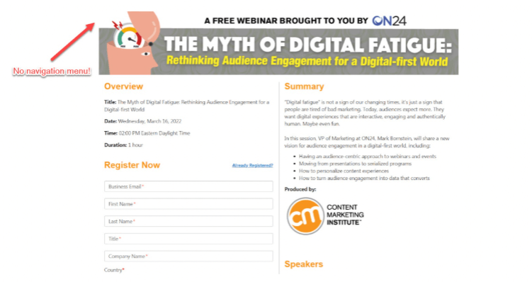
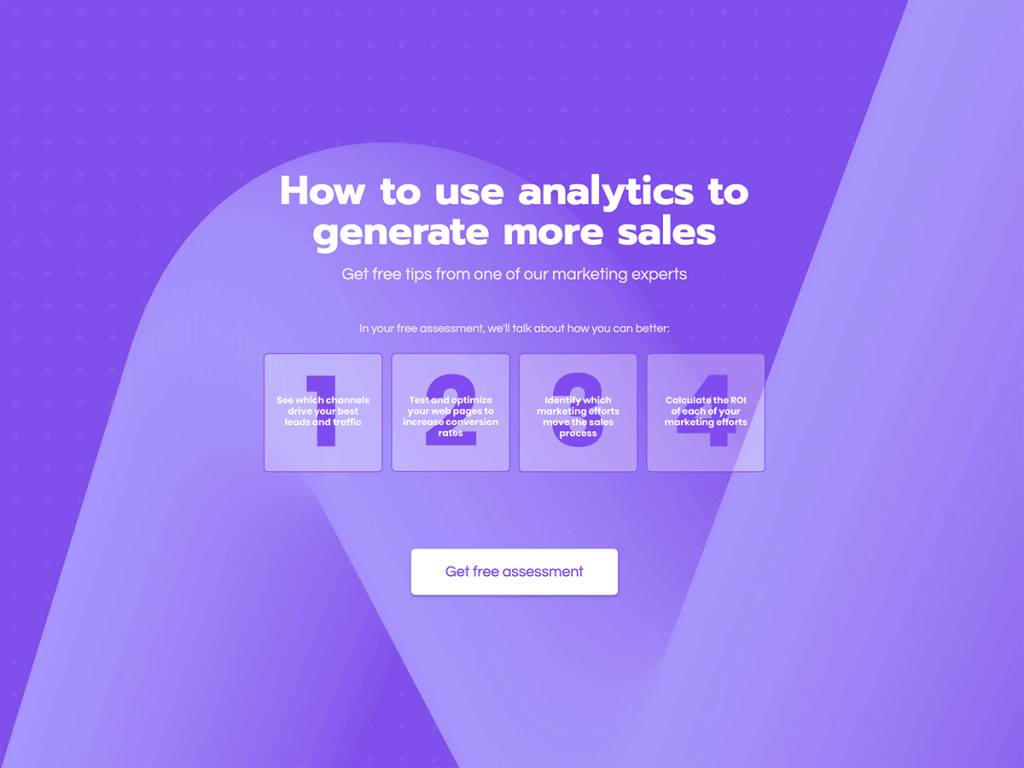
So, if your landing page is hosted on your website, remove its default navigational menu and other sections of your website containing links in them, similar to the example above. This ensures that visitors will stay on the page and hopefully fill out the form to join your webinar.
Also, consider removing social share buttons from the page. Some believe that they help spread the message about your webinar. Others say it further distracts visitors from completing the task set out by the landing page.
It’s best to test and see for yourself whether social buttons help increase signups within your target audience or lower conversion rates.
2. Craft a Compelling Story
A story allows people to latch on to your ideas and connect them with their experiences. In particular, create a narrative where visitors can sympathize with the problems and issues addressed on the page.
By developing an emotional appeal with your landing page’s content, you can convince your audience to buy into your idea much easier.
Also, the key to telling a story that compels people into joining your email list is knowing exactly who your target audience is. Identifying their demographics and psychographics helps you piece together who you should be targeting with your webinar.
Bonus Tip: If you operate a small business or have a tiny budget and need to create personas yourself, start with this overview of personas to understand the purpose. Then create one or more fictional characters who represent your targeted customer groups. They should align with your company values and voice, have a pain point you can solve in your webinar, and frequently use the same communication channels you’ll be using to promote your webinar. “Speak” to these persona types in your landing page, using their concerns and points of view to attract them to the webinar you’re promoting.
Then use the webinar as the solution that solves the issues you listed in the story.
A good way to develop a well-crafted story is by bringing to life a character who experiences the same problems as your target audience faces. Mirror the hardships weighing your visitors down with their projects or businesses by fleshing them out in the story.
An even better way to tell your story is to use interactive content on the landing page.
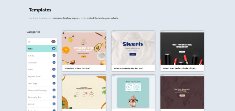
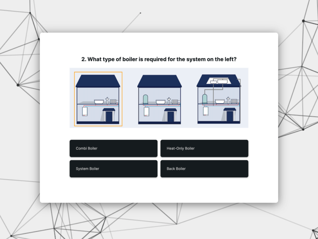
involve.me’s Lead Generation Quiz feature allows you to engage with your audience more effectively. You can do this by entering a set of questions asking visitors about their pain points. Ideally, you want the quiz to show them that they can overcome their hardships by joining your webinar.
From here, you can set up the end of the quiz to ask for their email address and confirm their registration.
3. Reveal Details About Your Webinar
Your webinar is the star of the landing page, and you want people to know everything about it. Spilling the beans about your webinar allows them to make an informed decision on whether or not to join (and not regret missing it).
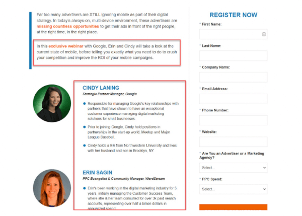
Here are three things to include on your page about your webinar:
The schedule of your webinar. Aside from sharing the exact time and date, you must also reveal who the speakers are, their respective topics, and their actual times. This way, people can look forward to learning from specific speakers and topics.
How long your webinar will be. You want people to fit the webinar into their schedule and prepare for it properly so they can learn as much information as possible.
Replay. For those who will not attend, inform them where they can watch the webinar recording. But make sure to share it with them weeks after the webinar. This way, you still give priority to people who attend.
As you’re adding details, if you find there’s a great deal of information that needs to be separated for clarity, you might want to consider moving from a landing page to a microsite, which you can think of as an independent small website that’s associated with your brand.
This might make sense if your webinar is a quarterly or annual event that has a large audience of followers and, perhaps, a stellar line-up of guest speakers. Or, it might be a technical subject that requires a lot of advance detail to let potential attendees decide whether or not they’ll attend.
In such cases, you’ll want to weigh the difference between a microsite vs. landing page to determine which is best for your webinar situation.
4. Add Social Proof
It’s one thing for you to say that joining your webinar will help attendees achieve their goals and solve their problems. It’s another if someone, like an attendee, says these things and has proof to back it up.
User-generated content like social proof remains one of the best ways to convert your audience into email leads of your webinar landing page.
It helps manifest their pain points into reality. Upon seeing testimonials from previous webinar attendees, readers tend to lower their guard, knowing that the glowing remarks about your webinar came from someone outside your organization.
That’s because the authentic words from the testimonial came straight from someone like them who had a breakthrough after applying the ideas you shared in the webinar.
If you haven’t flexed your social media muscle lately, get a refresher on social media optimization from experts on getting people actively focused, and read more about how social proof helps engage your audience.
5. Optimize Your Lead Capture Forms
Once you’ve compelled visitors to join your webinar, the next and final step is for them to fill out your lead capture form.
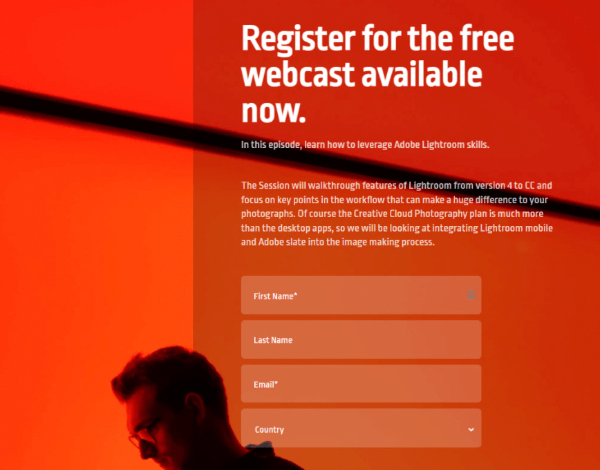
While placing the form on the landing page seems simple enough, there’s a chance some might not notice it on the page. However, observing lead capture best practices enables you to make your forms more accessible and add value to your audience.
This results in higher conversion rates, thus turning your webinar into a potential success!
Here are some of those best practices that will boost response from your webinar landing page:
Keep the number of fields as few as possible. Ask visitors to fill out only their name and email address, which go straight into whatever marketing automation tool you have chosen to manage your landing page outreach.
Let respondents know that you hate spam and won’t sell their information to anyone else. This gives them a sense of relief knowing that you’ll take good care of their personal information.
Place your form beside the offer above the fold, which is the most visible area of your landing page. You can also feature a button that scrolls back to the form when clicked on to ensure that visitors know where the form is.
Make sure the form’s submit button is actionable. For example, instead of “Submit,” use more deliberate language such as “Save my spot,” “View webinar,” or “Watch now” (if the webinar is already recorded and available on demand).
Throw in content upgrades like e-books, white papers, checklists, or other features to give them more reason to join your webinar.
6. Drive More Value to Your Landing Page Even After the Event
After the webinar takes place, don’t think for a second that your landing page won’t have any use anymore. In fact, this is the time you can make your landing page evergreen and, therefore, even more valuable.
As mentioned, you can wait a few weeks to upload the webinar recording for everyone else to watch. This gives people who missed it a chance to see what the fuss is about.
Also, you can launch an outbound email initiative to reach an audience of individuals about the webinar to help you grow your email leads even further.
Using email outreach tools like Mailshake or Lemlist (two examples of some of the best options currently on the market in the highly-professional-yet-affordable range, at around $100/month for a richly featured package), you can gather prospects and scrape their email addresses. Then, use that email marketing tool to send a campaign encouraging them to watch your webinar. Alternatively, if you use a full-service marketing agency, you can use their email marketing capabilities in concert with their fuller range of promotional services.
Now, if you have an upcoming live webinar, You can also create a pop-up box that appears on the screen, inviting prospects to attend your upcoming webinar — or after the fact, to see the replay. Set the box to appear before visitors leave the page or after scrolling down past half of the page.
The great thing about your landing page is that you can continue extracting more value from it by continuing to generate sign-ups to your email list even after the live webinar is over.
Or, if you want a different way to generate revenue from your webinar, you can sell it instead by charging admission!
In that case, set up a digital payment (one of the more current e-commerce trends) on the page to accept payments before or after the event. Then, using your automation tool, instantly send them the webinar video and other resources to sweeten the deal after receiving their payment.
Bonus Tip: Sometimes entrepreneurs are tempted to start their company with a landing page for a webinar or similar event, and build their company around the kind of audience that responds — those who are hungriest for the kind of product or content they intend to produce. This approach is best suited for introducing SaaS or online retail products, and it works better if you have previous experience building successful landing pages.
However, no matter how great your landing page is, it can’t “hang out there” alone for long – you’ll need to back it up with all the other tools of digital marketing your customers expect, from websites to social media to email. So, before you take this route, refresh yourself on the basics of e-commerce marketing and be ready to act on all those other fronts as well. Together, they will help boost your landing page results beyond your introductory period to sustain your new venture.
Get Started with Converting Lead Pages
With One Of Our 300+ Templates
Summing Up
Lots of businesses are launching webinars for good reasons. One of them is building an email list that you can monetize soon.
But for your webinar to attract your desired number of attendees and potential customers, you must build a landing page. It will help you communicate clearly what your webinar is about and optimize it to maximize signups. Hopefully, by applying the tips above, you should achieve this goal efficiently and collect a great list of engaged leads.
Author
Christopher Jan Benitez is a freelance writer for hire who specializes in the digital marketing field. His work has been published on SEO and affiliate marketing-specific niches like Monitor Backlinks, Niche Pursuits, Web Hosting Secret Revealed, and others.

