When we started working on brandquiz back in early 2018, we’d set out to develop a flexible quiz builder with the kind of design chops we hadn’t found elsewhere. While we still experienced the traditional twists and turns of an early stage product, we’ve come a long way since.
Now, over 5.5k commits later while we’re approaching the end of 2018, over 600 customers, from SMBs and agencies to global brands like Universal Pictures use brandquiz to create personalized interactive customer journeys for every step of their funnel.
Pro Tip: You can also create online quizzes using AI quiz generator within seconds.
“everything from quizzes, personality tests, interactive forms, giveaways & surveys to lead pages, calculators & much more!“

We’d been shipping many functional features in 3 week sprints throughout the year, and customers were happy. But now the time was ripe for tackling the UI & UX!
So with tons of real-world input we began tinkering and rethinking the look & feel of the interactive interfaces built with brandquiz. And today, after almost 2 months of design & code magic, we’re proud to introduce to you the all-new and enhanced brandquiz! 🎉
General Design Settings
We’ve created a quicker and easier way of making project-wide changes to the look & feel, by inserting an additional layer of design settings which take effect over all elements, on all pages within a specific project.
On this level, users can set a font for headlines & questions and one for all other text items, from text blocks to individual answers. There’s also a new option for setting the size of all questions to either small, medium or large.
Check it out:

Solid Design
Another new feature is the option to switch between solid and transparent design. With just the switch of a simple toggle you can swap between transparent and solid design of the whole project, and all without having to dig too deep into the settings of each element. Though there’s a treasure trove of additional design options for the ones amongst you who’d like to push the limits of customization. 😎
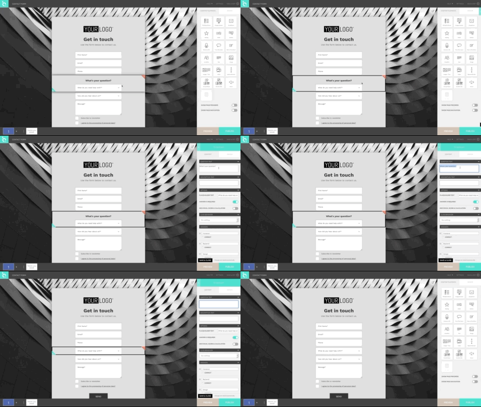
We’ve also redesigned all content elements, created harmonious proportions between them for both desktop and mobile and have even redesigned the error messages your users receive when not filling out your required fields. Working through all elements, we’ve also added most of the same options to all question type and form field elements, most notably the ability to add individual description texts as sub-headlines to the questions.
Additional Updates
To simplify the creation process and help you keep balanced proportions between content elements, we’ve added an automatic spacing adjustment of form and answer field type elements. So now, when you’re removing question and description texts, they just snap! together making seamless form creation finally a reality!

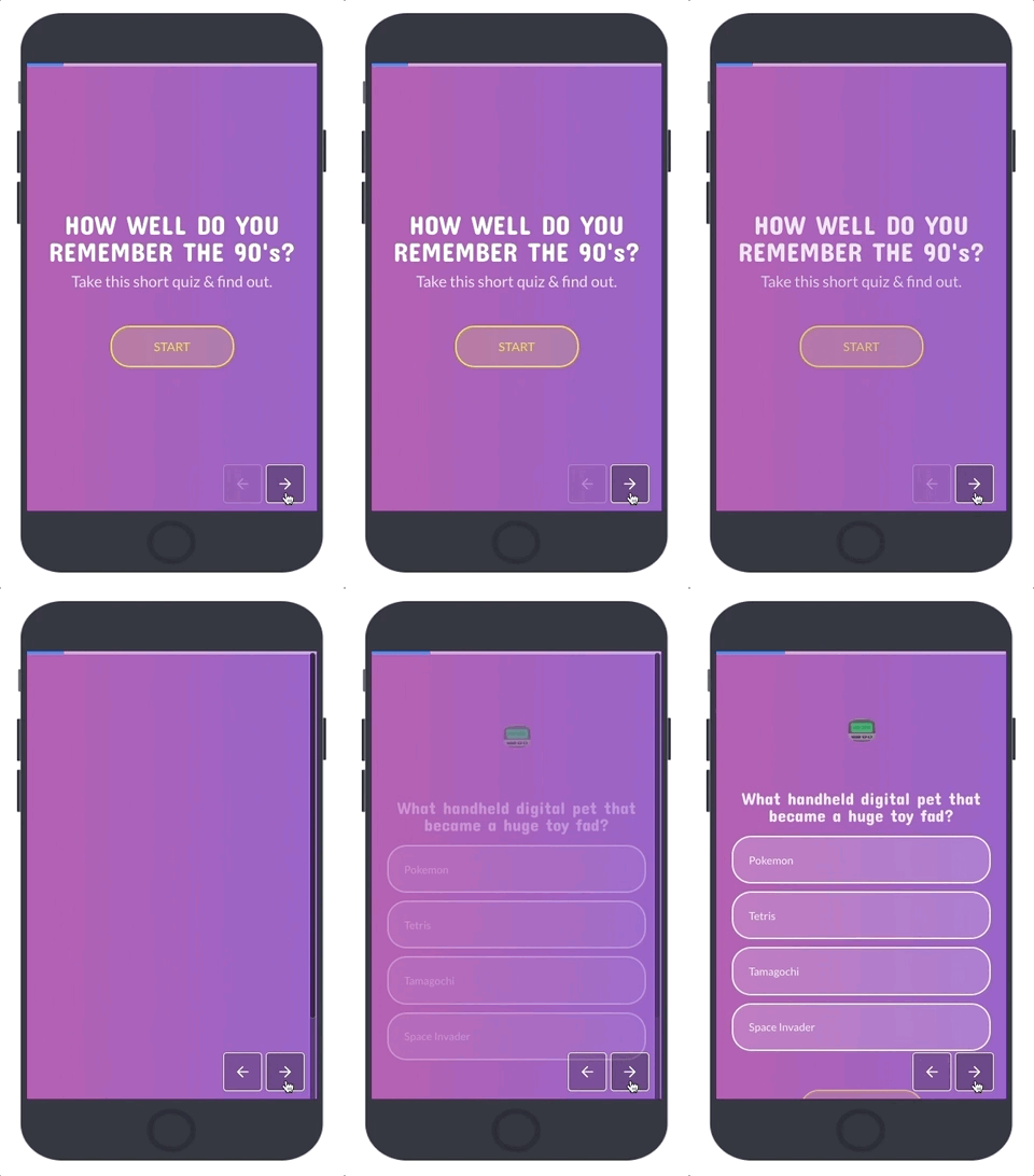
Additional updates include the ability to set the brightness of your project background and a brand new page navigation.

One challenge throughout the whole process has been to take into account the existing projects of current customers and implement the comprehensive UI & UX changes without disturbing the layout of live projects. As the platform remained live through the redesign, we’ve achieved this by not removing existing styling options, but rather reframing them within the UI.
Brand New Templates
Putting everything together and using the new features ourselves, we’ve also redesigned the old templates and created additional ones for completely new use cases such as Shopping Order Form, About Page and ROI Calculator. All in all we’re releasing a total of 64 professionally designed templates which you can use for free. Assets included! 😎
We’re just getting started on our way to reimagine customer experience and would love your feedback, requests & suggestions for improvement! 😍 🙌


