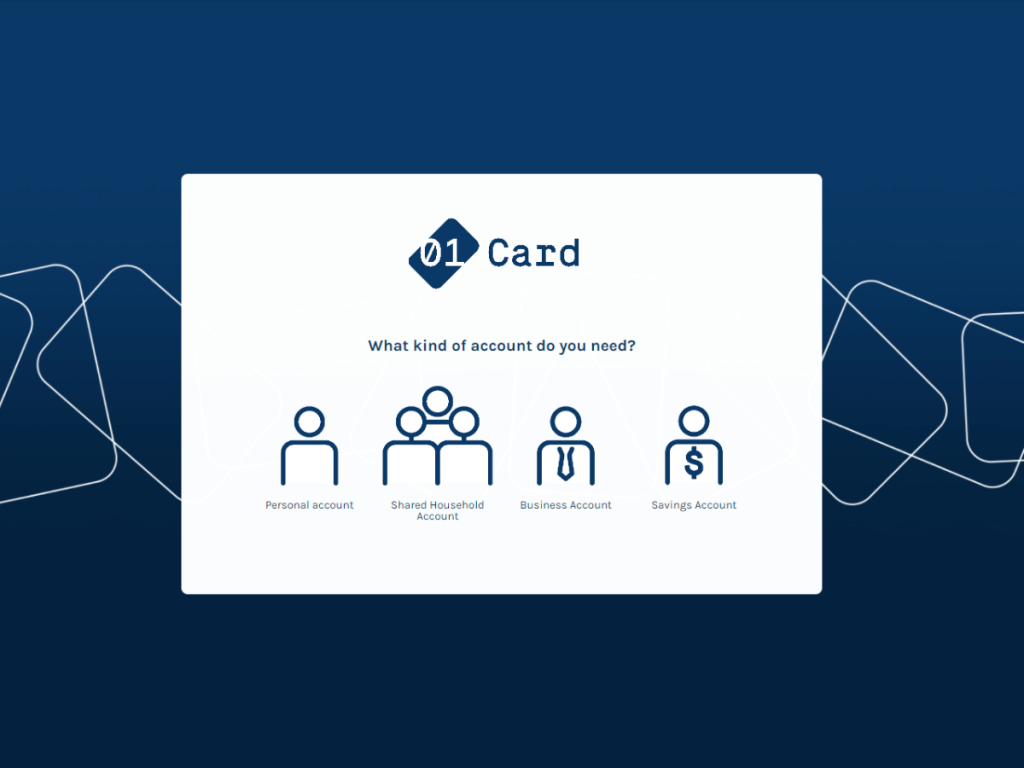
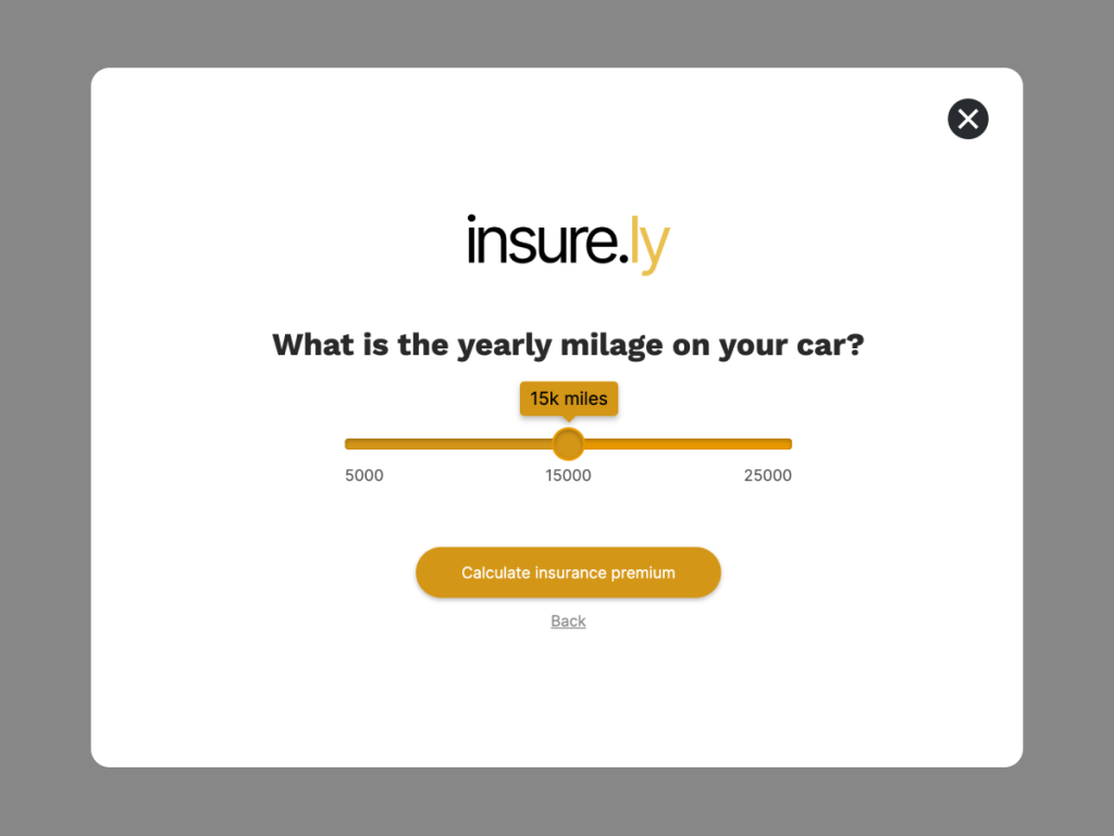
Quizzes have become an extremely important tool for online businesses. They are enormously effective in improving brand awareness, revenue, and marketing strategies, due to which many have decided to start implementing them on their websites, blogs and social media.
Many companies today run blogs due to their cost effectiveness, though by not using quizzes to interact with those blog readers, they’re leaving valuable engagement opportunities on the table.
Additionally, in the cases where companies do implement quizzes, there are certain mistakes that people tend to make when designing them, which end in clients or readers losing interest. Keep reading to find out which those mistakes are and, more importantly, how to avoid them.
What Are Quizzes For?
As we mentioned, quizzes function as a powerful marketing tool. Some of the benefits these instruments offer are:
A boost in reader engagement with your site.
Virality on social media.
Reduced bounce rate - people are 3x more likely to finish quizzes than forms.
Valuable insight about your audience based on their answers.
Get Started: Make A Lead Generation Quiz
Using One Of Our 300+ Templates
There’s a lot of ways of showing your quizzes through videos, websites, or pictures. Videos are always a powerful way to get a message across to your audience. If you find making videos too time-consuming, you can always use a tool like Fastreel or Biteable to create high-quality videos via drag and drop.
It’s common to see highly engaging quizzes that spread like wildfire on social media. This type of reaction can boost your traffic and, by extension, your passive income, so you want to make sure to keep an eye out and avoid all of the following mistakes:
1. Not Establishing Clear Objectives
The first mistake when designing quizzes happens even before writing question #1. Every quiz should have a clear purpose from the start, because that purpose will guide you throughout the entire creation process.

Be it to increase user engagement, to gain specific insight about your audience, or to establish yourself as an authority in a particular niche, you must define the purpose of the quiz before doing anything else; otherwise, the final result may not be what you hope for.
2. Asking Unnecessary Questions
One of the most common mistakes when designing a quiz is to overload it with unnecessary questions. Remember that your goal is to keep your customer's attention, and to do that, you need to make sure that your quiz doesn’t drift away from the main topic. Asking unnecessary questions will only increase the chances that the person who’s solving the quiz will lose interest.
To avoid these types of mistakes, you should first create a draft of all possible questions. After that, you should review each of the questions you wrote down, one by one, and ask yourself: does this question contribute to the quiz’s objective? If the answer is not a clear “Yes,” then strike it out and move on to the next one. This is why it’s so important to have a clearly defined set of objectives for your quiz, even before you actually start writing it.
3. Being Unclear
Another common mistake is writing questions that are not easy to understand or over complicated. If people don’t understand the quiz, odds are it’ll bring inconsistent results. Writing a question without having a clear context can also create confusion in your audience, so it’s a good idea to explain why each question is important.
The key to avoiding this mistake is to write your quizzes in a way that anyone can understand. Even if it is intended for an older audience, imagine that you’re writing a quiz for little kids; avoid using long and complicated words and keep things as short as possible.

It’s usually a good idea to have a friend or family member read the questions out loud and then rewrite any questions they don’t understand or that are in any way unclear.
Also, always remember to keep your targeted audience in mind. Do your best to get a deep understanding of who they are and what their needs are before crafting your content, in particular your quizzes. That will help guide you in terms of how complex or simple your writing can be, but regardless of that, make sure to keep things short and to the point.
4. Getting Too Wordy
When designing a quiz, it’s common to find that you’re adding too much detail to each question. This can make questions tedious to read and cause readers to lose interest. Not only will it look overloaded, but you will likely overwhelm those who are answering the quiz.
One way to avoid getting too wordy is to use standard prompts like ‘Who? What? Where? When? Why? and How?’ to start each question. This tends to force you to cut to the chase right away without digressing, helping you keep your questions simple and concise. Another tip is to limit the questions to one sentence each.
5. Providing Too Many Answers To Choose From
This mistake can go unnoticed since some quiz creators prefer to offer a wide variety of options to their readers. They seem to think that adding more options is better for the user.
Unfortunately, that's not how it works. Too many options mean more time to read through them all and might make users click out of the quiz or the website altogether. That’s definitely something you want to avoid at all costs.
But there’s a much deeper reason to avoid too many options: it can reduce the accuracy of the results you hope to gain from the quiz. The results of the quiz will not give straight and objective answers, but on the contrary, they'll be vague and broad. So, as you can see, not everything is how it looks. That being said, a better way to avoid this mistake is by limiting the number of possible answers to 3 or 4.
6. Accurate Answers
Apart from being relevant, clear, concise, and short, you have to provide your audience with an accurate set of answers. This means that you should always make sure that the answers you’re providing fit the questions you’re asking.
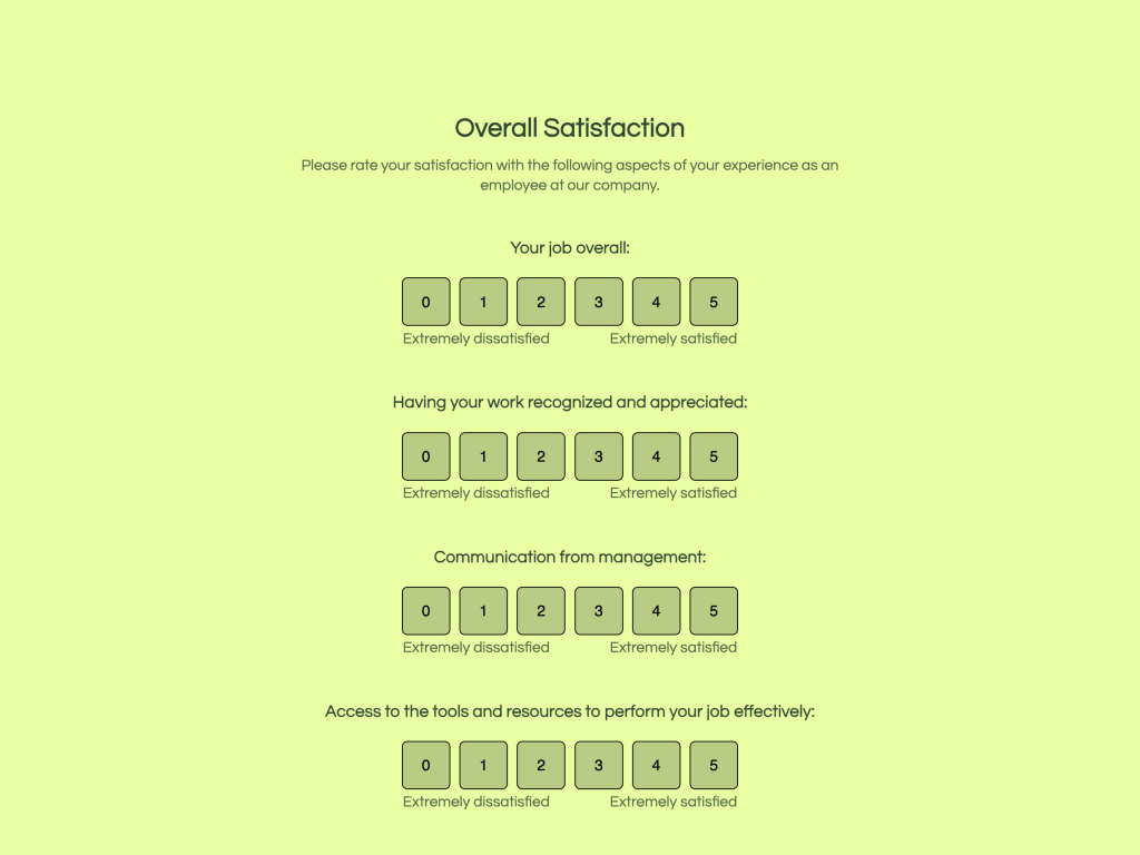
Additionally, you should always try to add a middle or “neutral” answer to every question. This is not always possible, such as in Yes/No or True/False questions, but you should do it whenever it makes sense. As you can see in the screenshot below, the person that designed the quiz didn’t put a neutral option, which means you're leading the audience with your questions.
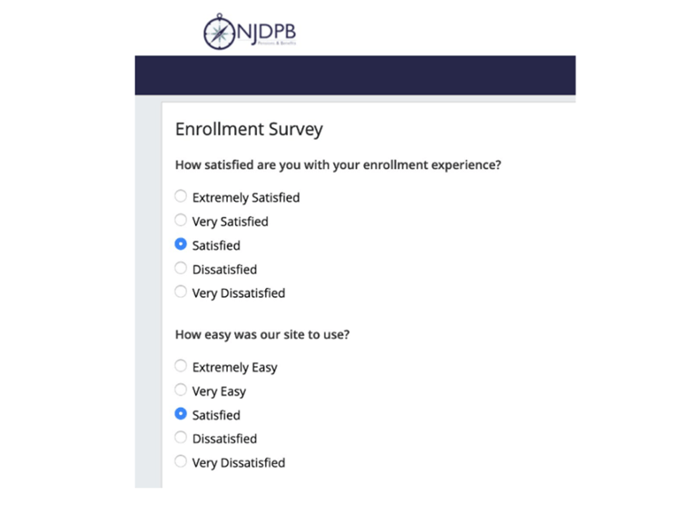
Source: NJDPB
The Bottom Line
Quizzes can be a strategic part of your digital marketing efforts and help grow your brand, so they must be implemented in the best way possible. A quiz can become an income-producing asset for you when done properly, generating new leads without any upkeep or additional investment.
So, for you to implement quizzes successfully and for them to provide you with the results you expect, always make sure to avoid the mistakes we covered here and follow these tips:
Establish clear objectives for your quizzes.
Avoid adding unnecessary questions.
Avoid using “fancy” or complicated vocabulary.
Avoid wordiness.
Provide simple and accurate answers.
Include neutral options.
Creating high-quality quizzes is a great and easy way to boost your customer engagement and potentially increase sales. If you haven’t been leveraging them on your site, it’s about time you started doing so.
Get Started: Make A Lead Generation Quiz
Using One Of Our 300+ Templates
Author
Jordan Bishop is the founder of Yore Oyster and How I Travel, two sites to help you optimize your finances while living an international life. He recently published his first book, Unperfect, an exploration of problem solving.

