In today's competitive business environment, it is tough to stay afloat without a steady stream of new leads. No matter how impressive your product or service is, it won’t do you any good if your sales funnel dries up.
To make sure that you are continuously bringing in prospective customers, you need to design an effective lead capture page. This page should be set up to convert as many website visitors into contacts as possible — but that can be easier said than done.
Fortunately, this article will cover the key elements that every lead capture page should have as well as the best practices to follow for optimal results. So if you are ready to create a lead capture page that actually converts, keep reading!
What Is a Lead Capture Page?

Gymshark’s eye-grabbing lead capture page has a clear value proposition.
A lead capture page is a type of landing page that is designed to collect contact information from website visitors. Typically, lead capture pages offer something of value in return for an email address, phone number, or social media profile. This could be a free e-book, product discount, access to a webinar, or any other digital asset.
Once the visitor provides their contact information, the lead capture page delivers the promised incentive and redirects the user to a product page or sales funnel for further lead nurturing.
Lead capture pages are effective because only a small percentage of visitors become customers on their first visit. By gathering contact information, you can establish direct communication and follow up with leads over time. These leads form the foundation of future email, SMS, and social media marketing campaigns.
6 Key Components of a Lead Capture Page
Lead capture pages should be simple and streamlined. The goal is to make it easy for visitors to take action and provide their contact information. To do this, build a lead capture page with only these 6 components:
1. Eye-Catching Headline
Start by crafting a headline that clearly communicates the reason a visitor should share their contact information. This should be short, concise, and persuasive. Avoid any jargon, technical terms, or overly clever phrases — potential customers should be able to immediately understand the value of your offer.
2. High-Quality Image

This image is an appealing depiction of what #vanlife could be like.
A crisp image can help draw attention and emphasize the appeal of your offer. Make sure that the visual is relevant to the headline and clearly communicates the proposition.
But rather than highlighting the features of your incentive, focus on its benefits. Use the image to illustrate the impact of taking action and what kind of transformation prospects can expect. For example, if you are offering a free e-book on how to start a software business, then consider using a picture of a budding entrepreneur.
3. Compelling Ad Copy
When your headline doesn't convert a visitor, your ad copy gives you one more shot to convince them to take action. Keep this section brief and skimmable because you may only have a few seconds of their attention.
Use social proof, previous results, testimonials, and anything else you can think of to build trust and demonstrate the value of your incentive.
And don't fall into the trap of boring visitors with a long list of everything that your offer includes. Instead, quickly prove to prospects that your business can help them reach their goals.
4. Optimized Lead Capture Form
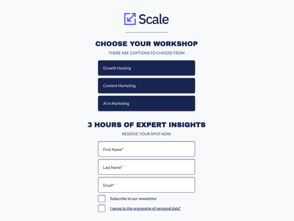
Your lead capture form should be visible, easy to find, and take no more than a few seconds to fill out. Generally speaking, the fewer fields you include, the higher your conversion rate will be. But at a minimum, you should ask for an email address and any information that is necessary to categorize the lead.
Simplify your lead capture form as much as possible with autofill options and drop-down menus. Also, make sure that your form is optimized for mobile devices. After all, more than half of website traffic now comes from smartphones and tablets.
5. Prominent CTA

This offer for a free ebook by Chattanooga is a clear example of a compelling CTA.
The CTA, or call-to-action, is your final chance to nudge visitors forward. It should be a simple, obvious, and prominent button just below your lead capture form.
To ensure it stands out, use bright colors and actionable language like “Get Started” or “Sign Me Up”. You may also experiment with directional cues, like arrows or hands pointing to the button, and different text sizes.
6. Clear Privacy Policy
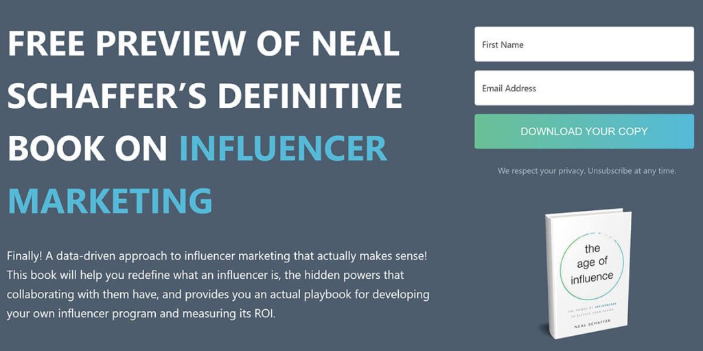
Neal Schaffer uses a simple and clear privacy statement.
Put your visitors at ease by confirming that their data is safe and secure. Just below your CTA, include a link to your Privacy Policy and a short summary of your commitment to protecting users' personal information.
This will establish trust and reassure visitors that their information will be kept confidential. Plus, in most cases, it will increase the conversion rate of your lead capture page.
7 Lead Capture Best Practices
After you piece together a lead capture page, you may think your work is done. But not so fast! To ensure that you are getting the most out of your marketing efforts, here are 7 lead capture best practices to keep in mind:
1. Grab Attention
And do it quickly! Your lead capture page needs to make an impact right away. Otherwise, distracted visitors will bounce and you will begin missing out on leads. Use bold headlines and striking images to capture attention and guide prospects to the next step of your sales funnel.
2. Review Positioning
Look at the lead capture page from your customer's perspective. Does it make sense? Is it above the fold? Or do prospects have to scroll down to find it?
If your form and CTA are not immediately obvious, your conversation rate will suffer. Shift them around until your lead capture page is simple to navigate on every device size. If you are worried that prospects will miss crucial information as a result of this format change, see tip number 7.
3. Provide Real Value
The more enticing your lead magnet is, the better your lead capture page will perform. Offer a product sample, resource, or discount that your visitors simply can't refuse and they will happily give you their contact information. In fact, they may even share the lead capture page with friends and family!
4. Consider Form Length
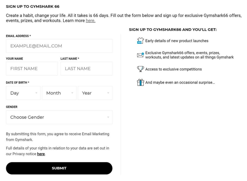
Gymshark also offers a 66-day challenge with a much more detailed lead capture form.
The length of your lead capture form is a delicate balance. If you require too much information, visitors may become overwhelmed and abandon the form altogether. On the other hand, if you don't ask for enough details, lead segmentation and qualification will become difficult.
A common rule of thumb is that longer forms lead to higher-quality leads. However, longer forms also lead to lower conversion rates.
As a starting point, look to your competitors for a sense of other lead capture pages in your industry. Then, conduct A/B tests to determine the optimal form length based on lead value.
No matter how long of a form you choose, strive to keep sentences short and concise. This type of efficient communication is important for maintaining engagement and completion rates.
5. Minimize Friction
Eliminate any obstacle that could deter your prospects from completing the lead capture form. This may be an annoying captcha, a confusing page layout, or a checkbox that is too hard to find. Make your lead capture form as easy and effortless as possible and you will see a noticeable boost in conversions.
For example, if all of your leads are in the United States, remove the 'Country' field entirely. These seemingly insignificant tweaks will improve your marketing efficiency and translate to more qualified leads.
6. Remove Distractions
After you remove every friction point, consider removing anything else that could lead visitors away from the lead capture page. This includes navigation menus, unrelated images, and even footer links.
Apart from your lead capture form and CTA, the lead capture page should be uncluttered and distraction-free. This streamlined layout will ensure the highest percentage of prospects make it to the finish line.
7. Split Test
Test, test, and retest! To create the best-converting lead capture page possible, consistently experiment with design elements such as copy, form length, and CTA color. There is no ‘one-size-fits-all’ template — what works for one audience may not work for another.
So be sure to keep A/B testing your page with a purpose. Every test should have a hypothesis, and the results of every test should provide an insight. Over time, this optimization process will lead to a better-performing lead capture page and a better understanding of your target market.
Wrap Up
An ineffective lead capture page can be the difference between a successful marketing campaign and a total waste of resources. Before you drive traffic to your form, make sure it has all 6 essential components and follows our 7 best practices.
With these tips in mind, you will be able to design lead capture pages that convert visitors into contacts. This will produce a larger email list, more sales, and a healthier bottom line.
So what are you waiting for? Create your next lead page with involve.me today!
Author
Daniel Anderson is a marketing expert who writes about building, buying, and scaling businesses. Learn how to turn ideas into income and plan for financial freedom with the step-by-step guides at TheMoneyManiac.com.

