Only 2% of website visitors turn into leads. Why? Supposing the traffic you’re getting is relevant, the reasons your visitors are not converting into leads can be:
unclear mission statements
little to no options to engage
messy copy you can’t scan through
Website traffic seems to be the new social media following - less people than you think have figured out how to monetize it accordingly. Companies flaunt how many unique visitors they get each month, but when asked how many of those visitors at least leave an email, things get awkward.
Having traffic for the sake of having traffic is great if that’s your prerogative. But if you want your website to make you money, then we need to rethink your marketing strategy. Or, in most cases, at least have one.
A solid website analysis can save you a sizeable chunk of ad spend. You need to be able to harvest the clicks into leads and start meaningful conversations that feel human. There are two types of metrics you should look at when analyzing your traffic conversions:
1. Visitor to Lead Conversion Rate
The more visitors you turn into leads at no additional cost, the easier your job as a marketer will be. A website optimized for visitor-to-lead conversions saves you time and ad spend. In order to optimize your page for more conversions, you need to:
Communicate what your company does in a clear and concise way
Address who the product/service is and what results can they expect
Incentivize conversations with these people in a way that feels personal and human
2. Lead to Customer Conversion Rate
After you have collected leads from your stunning, well-optimized website, it’s up to your funnels to convert them. Segmented email automation, Facebook Pixel retargeting or personal follow ups are best marketing strategies to convert your leads into customers.
This article is about the first type, so let’s take a closer look at how to optimize your visitor to lead conversion rate.
Ways to Optimize Visitor Lead Conversion Rate
1. Clear Up Your Mission Statements

Source: Hackermoon
For the love of God and all that’s holy - just tell me what your company does. Lines like “We believe in making people’s lives easier”, “Deliver exceptional service” or “Reinvent best-of-breed architectures” sounds like you pulled words from a hat of corporate lingo. (Which I actually did here.)
Source: Oprimizely
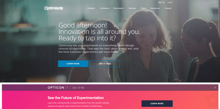
Let’s have a look at Optimizely. The “But WHAT do you do?” factor is exceptionally strong with this one. Nearly half of the visual space taken by the copy just says “Good afternoon!” More like “Enjoy spending the rest of your afternoon figuring out what we do.”
Informing your visitors what your company does is your job, not theirs. An uncreative, but fail-proof way to communicate your mission statement (and I’m sure you’ve seen this way too many times before) are slight variations of this formula: We help (your buyer persona) + (the problem your company solves).
See if you can recognize companies who use this formula: We help marketers collect more leads. The best place for content creators to network. Manage your team’s work, projects and tasks online.
2. Add More Engagement Opportunities
Converting your website visitors into leads can be as easy as saying hi. Literally, just say hi to your visitors. Be human, there’s technology for that.
2020 is the year of interactive content. Highly personalised initial interactions not only make your website stand out from the competition, but also convert more of your traffic at no additional cost.
Interactive content embeds on your landing page can start that crucial first conversation in a personalized way that feels human. When most of your visitors are too shy or undecided to reach out and start a conversation, it’s up to you to engage them.
Inspect your forms. Are they fun? Less than half of users who start filling up a form end up submitting their contact information. Bad forms literally kill purchase intent.
Treat your forms like a natural conversation. Acknowledge what the person is saying and continue the conversation accordingly.
This form may look custom coded, but it’s really just drag and drop. The increasing push for marketers learning to code creates SaaS that addresses the issue. involve.me let you create forms, lead pages, calculators, product configurators, surveys and quizzes without writing a line of code.
Gamify your data collection process to convert more visitors into leads. Why not stand out and hide your data collection form in a quiz? This homepage quizz divides involve.me’s product into five categories and quizzes to user to pick the perfect fit for them.
Quizzing your users accommodates their short attention span and presents a solution to their exact pain point in seconds. Interactive content gives you multi-level segmented leads from their first point of interaction with your website. Knowing what your leads want since the first contact point makes it a lot easier to convert them later on.
3. Make Your Website Copy Easy to Scan Through
This one is a no-brainer - people don’t read. Blog posts, maybe. The rest of your page? Forget it.
You have less than 30 seconds to tell your average visitor what your product does, why can’t any other product do it and where to sign up for it.
That’s a lot of information. And the more you write about it, the less will your visitors actually read. Pick high conversion intent words and highlight them in smaller text segments.
Source: ConvertKit
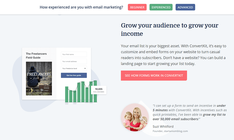
ConvertKit does a great job at funneling their website visitors down a nurturing purchase path. It divides their SaaS functionalities into three categories: how to grow your audience, how to segment your audience and how to convert your audience. ConverKit then serves these functionalities to their visitors on three golden platters.
Another masterfully executed rendition of this approach is Wix.com. Wix optimize their website copy for conversions so beautifully, it would make a grown man cry. (Seriously, I don’t think I’ve ever seen my supervisor get so emotional.)
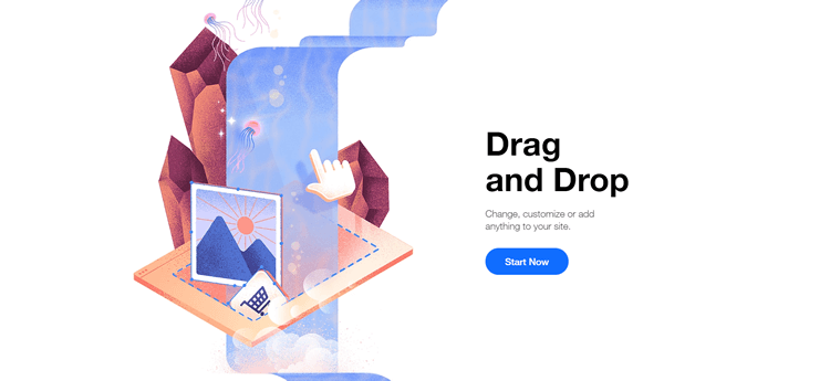
Functionalities and use cases literally cascade down Wix’s landing page in delightful, gourmet bite size portions. And again, you don’t need to know how to code to create artful landing pages that make the angels sing.
Do yourself and your developer a favour and drag & drop your lead page instead. Your time, patience and end-of-quarter induced panic is limited. Steal some of these ideas and see how they would look for your brand.


